5 Really Useful Responsive Web Design Patterns
Responsive web design requires a very different way of thinking about layout that is both challenging and exciting. The art of layout was already complex enough for the centuries that it was defined by fixed elements, now things are becoming exponentially more complicated as layouts become increasingly adaptive.
To help reprogram your brain to consider layouts in new ways, we’re going to take a look at some interesting responsive design patterns that are being implemented by talented designers all over the web.
2 Million+ Digital Assets, With Unlimited Downloads
Get unlimited downloads of 2 million+ design resources, themes, templates, photos, graphics and more. Envato Elements starts at $16 per month, and is the best creative subscription we've ever seen.
Starting Small
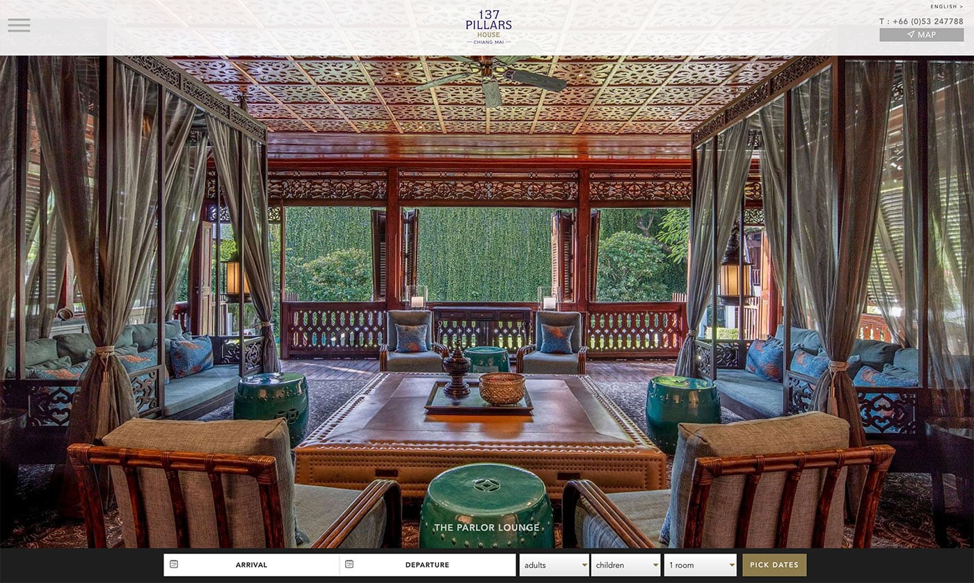
One of the most popular ways that I see responsive design being implemented is to simply assign a fluid width to the columns of content on the page, which become narrower and narrower as the page width decreases until the one major jump to a single column mobile layout. We can see this technique at work on the luxury hotel website 137 Pillars House.
As you can see, the layout really only goes through a single major transformation. The rest of the adaptation is very gradual and is merely a narrowing of the initial layout.
This seems to be how many designers are sticking their proverbial toes in to test the waters of responsive design. It’s a great place to start because it can require much less time and effort than multiple major transformations while still offering the benefit of serving up a web page that looks great in any viewport size.
Rather than simply flirting with responsiveness though I want to encourage you to take the plunge and explore the vast possibilities that are now available to you in terms of layout design. Don’t get me wrong, there is nothing wrong with the approach above, but it’s always a good idea to take your skills a step further and stretch what you consider yourself to be capable of pulling off.
Mondrian
Our first responsive web design pattern was one that Piet Mondrian would’ve appreciated. It uses three simple and large areas of content separated by thick lines. The initial state itself is quite versatile and can hold up well under a fairly intense reduction of width.
Once it becomes too narrow for the initial state though the widescreen layout adapts and becomes a vertical layout. This is accomplished by taking the two smaller boxes on the right and moving them under the large, featured box. This layout then breaks down to our standard single column mobile view where each piece of content is simply stacked under the last.
Basic Gallery
Thumbnail galleries are a popular design pattern that has existed for nearly as long as the web. These days designers usually keep them quite minimal: simple rectangles arranged evenly on a solid background. This format is super easy to reflow as the viewport changes. You simply have to reduce the number of columns a few times.
We went over this process in depth in our article on building a responsive thumbnail gallery so be sure to check that out if you’re looking for a step by step guide of the process.
In The Wild
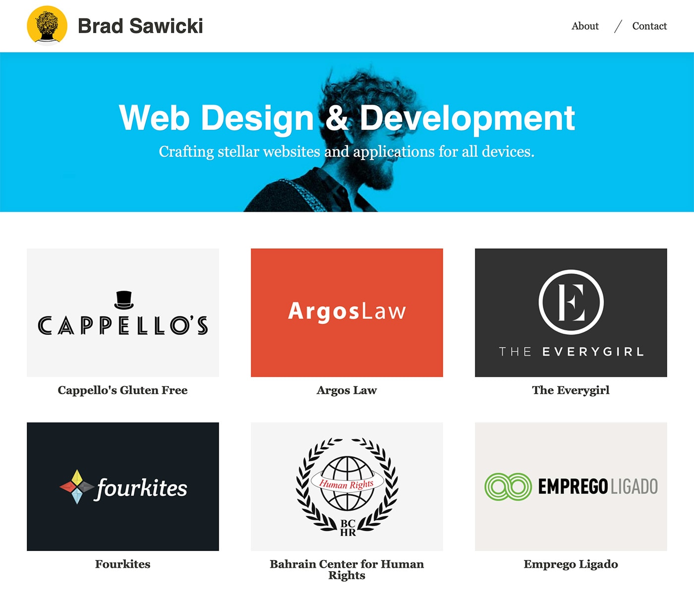
To see this pattern in an actual site, check out Brad Sawicki’s portfolio. Right on his homepage he starts with a simple three column gallery that collapses down to a double and finally a single column layout. The benefit here is that the work preview image sizes make the most of the available viewport so that the viewer can always see them in a nice, large format.
Featured Items
This one is a lot like the gallery layout, only it’s more geared towards highlighting a few items as opposed to several. The example here utilizes four featured items but it’s just as popular, or even more so, to see three items instead.
As you can see, the layout starts with the four featured items side by side with some introductory content above. It then follows the path of the gallery as it jumps down to two columns and finally one. Notice how the introductory content adapts as well: the navigation goes from the right side to flush left under the main headline or logo.
Column Flip
This one of the most complicated pattern yet. The top of the layout features some really large elements that grab your attention and introduce the site. The next portion is split into three columns, but as you reduce the size of the browser, the first column flips onto its side and becomes a row that sits above the other two columns.
It’s a fairly complicated transformation but it’s quite effective. You could easily pull it off simply by adding in a media query that floats the items in that column to the left, then clearing the float so the other two columns remain intact.
The final step is of course to reflow everything once again to one wide column. It can make for a lot of scrolling but as long as you don’t overflow the page with content it’s not too bad.
In The Wild
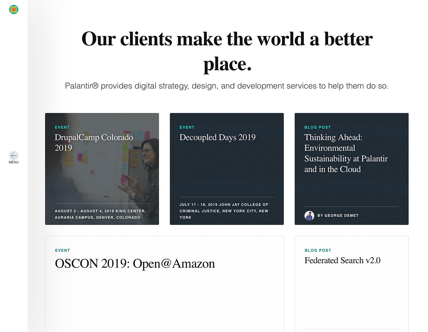
Inspiration for this layout comes from Palantir, another development company. Notice that web developers are first experimenting with responsive design on their own sites, which can serve as both a great learning experience and an example for clients.
Palantir is a shining example of just how drastic your transformations in responsive web design can be. This is more than merely reducing the width of a column or eliminating it completely, it represents a major reflowing of the page’s content to continually maximize the available width.
Feature Shuffle
This last pattern is a different take on the featured items idea. I really like it because it throws a slight curve during the first reflow. Instead of simply dropping to two columns and floating left, it creates a staggered two column layout where sections are floated to either side.
For the single column layout, the thumbnail images are dropped altogether to allow for greater emphasis on the text content. This is optional of course, one of the previous single column formats could just as easily be implemented.
In The Wild
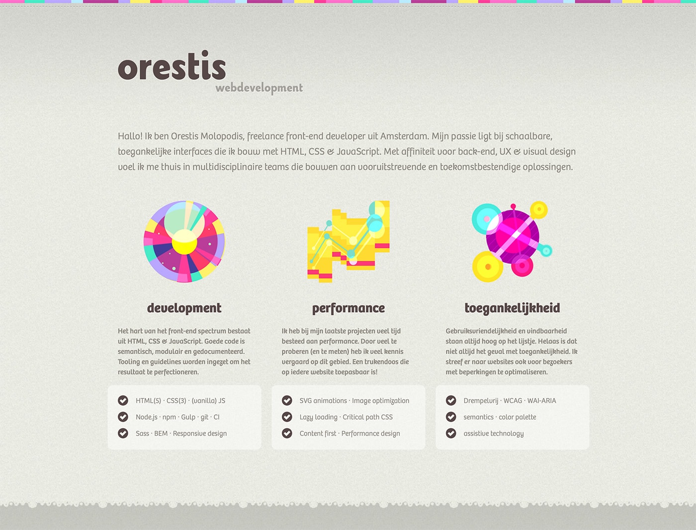
Orestis uses this pattern on their site. The three featured items are the services that they offer, each of which is represented by a colorful illustration.
When you resize the browser, the services are stacked and the images are floated either to the left or right. It’s a fun, quirky site that you have to check out yourself to really get a feel for how it all works.
More Patterns
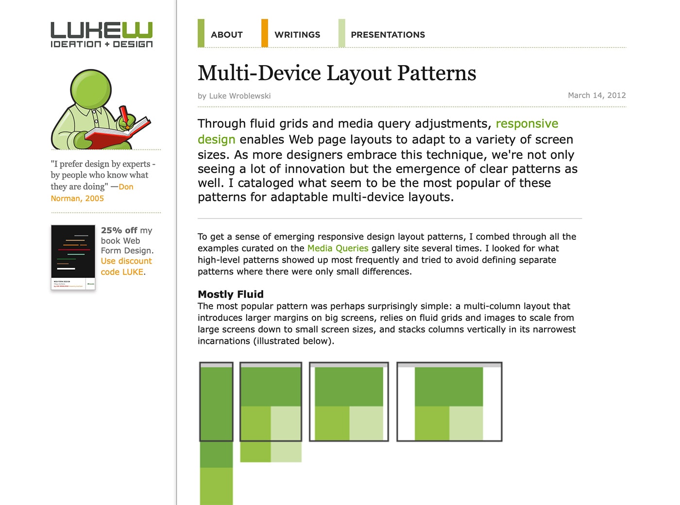
In my research for this piece I came across an existing article by Luke Wroblewski on the same topic. Rather than looking at very specific patterns like I have done here, Luke does an amazing job of really breaking common layouts down to their most basic ideas and showing you how they work. It’s a really great piece and I really like the way he shows how the layout works both inside and outside of the canvas.
Conclusion
I hope your mind is now in overdrive thinking about responsive layouts. The web design community has spent a ton of time discussing the technical aspects about how responsive CSS is accomplished through media queries, it’s definitely time that we start giving some deep thought into the actual design aspects of this exciting new frontier.
Leave a comment below and let us know what you think of these responsive design patterns. Would you use any of them in your own work? Why or why not?
