Typography

Learn how to work with fonts, lay out typography, pair different typefaces, and find collections of inspiring fonts to use in your next project.

30+ Typography Trends for 2024

Font Collections / 25 Jun 2024

30+ Typography Trends for 2024

Want to give your design a quick facelift? Using new and interesting typography trends might be the answer. Designers are using bold colors, cutouts, gradients, and even customizations to create lettering that stands out.

Changing typefaces or recreating an image or header in a trending style can give a design a fresh look without a full-scale overhaul. Not sure where to start? This list features typography trends with examples to use as inspiration for how to use them.

Here’s a look at the top typography trends this year.

10 Web Design Trends We’re Already Over

Graphics / 18 Jun 2024

10 Web Design Trends We’re Already Over

Design trends play a big role in moving the web design industry forward. However, most of the new web design trends usually fade away as fast as they appear.

It’s part of innovation. As technology evolves better and more creative trends appear. And we replace the old trends with those newer design trends. The problem is, sometimes we forget to let go of those old design trends.

So in this blog post, we share with you some of the outdated web design trends that need to go away. These design trends are no longer relevant and some of them could even lead to major issues with website functionality.

See if you’re still using any of these design trends.

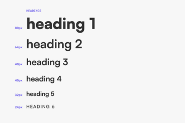
What Is Hierarchy in Typography?

Typography / 22 Apr 2024

What Is Hierarchy in Typography?

Typography is not just about choosing attractive fonts; it’s about effectively organizing content to guide the reader through a text in a meaningful way. Hierarchy in typography is a critical tool that helps designers achieve this goal.

It shapes the way information is perceived and understood, ensuring that the most important elements catch the eye first. It’s an important concept that all types of designers should know about.

In this comprehensive guide, we explore the concept of hierarchy in typography, its fundamental components, practical applications, and tips for mastering typographic design to enhance communication and engagement. Let’s get started.

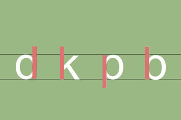
What Is Stem in Typography?

Font Collections / 15 Apr 2024

What Is Stem in Typography?

One of the most important yet overlooked elements in typography is the Stem. The stem stands as a foundational feature in the anatomy of typography and it’s something every designer should learn to observe and leverage.

In this article, we dive into the definition of stems in typography, their significance, and how understanding stems can enhance your typographic designs.

With practical tips and insights, this guide will help enrich your design projects even further, whether you are crafting digital content, print materials, or exploring creative typography.

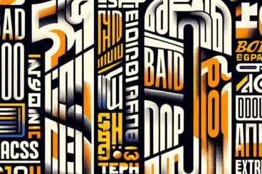
10 Bad Examples of Typography (& What to Learn From Them)

Font Collections / 12 Apr 2024

10 Bad Examples of Typography (& What to Learn From Them)

Finding the perfect font pair, adjusting font spacing, creating contrast, and improving readability is a process that takes time and experience. Unfortunately, many choose to skip this process by randomly using fonts that just “look good”, which leads to disastrous typography designs.

Today, we take a look at some of those bad typography examples to see what we can learn from them.

Good typography design is crucial to the success of every design. And with these examples, you will be able to learn how to avoid making such costly mistakes in your design projects.

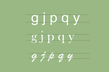
What Is a Descender in Typography?

Font Collections / 8 Apr 2024

What Is a Descender in Typography?

In the world of typography, every curve, line, and stroke plays a critical role in crafting readable and visually appealing text. Among these nuanced elements are descenders, the elongated tails on certain lowercase letters that dip below the baseline.

In this quick guide, we explore descenders, their significance in design, and the impact they have on legibility, aesthetics, and spacing in typographic works. Whether you’re a seasoned designer or a typography enthusiast, understanding descenders can enhance your appreciation and application of text design.

Let’s dive in.

What Is a Ligature in Typography?

Font Collections / 11 Mar 2024

What Is a Ligature in Typography?

Typography is not just the art of arranging type but also a science that involves intricate details, significantly impacting readability and aesthetic appeal.

One such detail, often unnoticed by the untrained eye but crucial to the cohesiveness and beauty of the text, is the ligature.

In this article, we explore the world of ligatures and uncover their history, types, and significance in modern typography. Understanding ligatures can elevate your design work by adding a layer of sophistication and improving text readability. Here’s how.

What Is X Height in Typography?

Font Collections / 4 Mar 2024

What Is X Height in Typography?

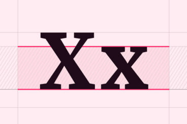
In the intricate world of typography, each element plays a pivotal role in shaping the readability, aesthetics, and overall impact of printed and digital text.

One such fundamental aspect is the ‘x height’, a term that might seem cryptic to the uninitiated but is crucial for designers and typographers.

In this quick guide, we aim to demystify the concept of x height, exploring its significance, how it influences typographic design, and the considerations designers must make when selecting or creating typefaces.

By understanding x height, we can appreciate the subtleties that make typography an art form that communicates beyond mere words.

What Is a Widow or Orphan in Typography?

Font Collections / 22 Jan 2024

What Is a Widow or Orphan in Typography?

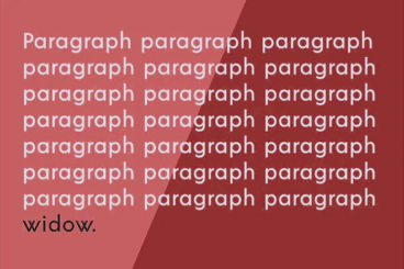
In the realm of typography, two terms often cause confusion for designers and typesetters alike: widows and orphans.

These seemingly small details can significantly impact the readability and aesthetic quality of a text. Understanding what they are and how to manage them is crucial in producing polished and professional-looking documents.

In this post, we explore the concepts of widows and orphans in typography and offer tips on how to handle them effectively.

What Is Kerning in Typography? + Tips & Examples

Font Collections / 10 Jan 2024

What Is Kerning in Typography? + Tips & Examples

Kerning, a term frequently encountered in the world of typography, is a critical element in creating visually appealing and readable text.

It refers to the adjustment of space between individual letter pairs to ensure consistent and harmonious spacing throughout the text. Effective kerning prevents the text from appearing uneven or cluttered and enhances overall readability.

In this article, we explore the nuances of kerning in typography along with practical tips and examples to help designers make informed kerning decisions.

100+ Best Condensed & Narrow Fonts of 2024

Font Collections / 9 Jan 2024

100+ Best Condensed & Narrow Fonts of 2024

Contrary to popular belief, condensed and narrow fonts don’t make your text cramped or crowded. You just have to know the appropriate time and place to use the font. Condensed fonts are widely used these days for headlines and portraying bold messages, and when deployed in the right place, they can give stunning impact!

It takes a lot of testing and experimenting to find the perfect font for a design, but our tips for choosing and working with condensed and narrow fonts will help get you off to a great start!

What Is Leading in Typography? + Tips & Examples

Font Collections / 3 Jan 2024

What Is Leading in Typography? + Tips & Examples

In the world of typography, ‘leading’ (pronounced as ‘ledding’) is a term that often surfaces, especially in discussions about readability and design aesthetics.

Originating from the days of manual typesetting, leading remains a fundamental aspect of modern typography. It impacts how text is perceived and can dramatically influence the readability and overall look of a printed page or digital screen.

In this comprehensive guide, we delve into the concept of leading, its significance, and how to effectively apply it in your typographic work.