Navigation

Learn how to craft effective navigation for your website — on desktop or mobile. Design navigation that helps users easily find what they’re looking for.

What Is a Sitemap in Web Design?

Navigation / 18 Mar 2024

What Is a Sitemap in Web Design?

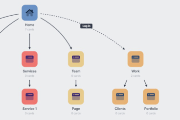
The sitemap is a pivotal component of a website’s architecture. It’s a strategic tool that organizes and clarifies the structure of a website both for its creators and its users.

In this post, we delve into the essence of sitemaps in web design, exploring their significance, varieties, and the benefits they bring to user experience and search engine optimization (SEO).

Sitemaps play an important role in the web development process and learning how to leverage them effectively is key to building a successful website.
8 Tips for Better Hyperlink Text

Navigation / 20 Dec 2021

8 Tips for Better Hyperlink Text

Better hyperlinks will create more useful user experiences. It starts with the words you use in the button or linked copy. (And “click here” is not the answer!)

If you want to generate more—and better—conversions from links, it’s important to focus on writing better microcopy for every link on your website.

These tips, which apply to hyperlinks throughout the design (not button microcopy) can help you think through the process.

Join us as we explore pitfalls to avoid, tips for punctuation, and the types of visual indicators that work well for links.

An Introduction to Horizontal Scrolling (+ Pros and Cons)

Navigation / 7 Jul 2021

An Introduction to Horizontal Scrolling (+ Pros and Cons)

Horizontal scrolling has come a long way from hero sliders. It’s now simpler to implement, somewhat more acceptable from a UX point of view, and offers plenty of creative opportunity.

A horizontal scrolling technique can be engaging and visually interesting. Conversely, some elements can be missed by users and it can present some accessibility challenges.

Here, we’ll look at everything horizontal scrolling, including pros and cons to help you figure out if this technique is right for your website design projects.

5 Reasons to Avoid the Desktop Hamburger Menu Icon

Navigation / 18 May 2020

5 Reasons to Avoid the Desktop Hamburger Menu Icon

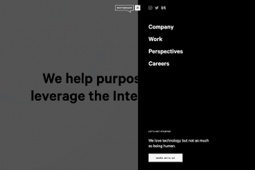
A hamburger icon as the only source of navigation on a desktop website sucks. It’s frustrating, confusing, and violates unwritten rules of navigation and user flow best practices. Why would you do it? Other than to maintain or establish a certain aesthetic, it’s hard to find an answer that makes any sense.

The often-debated hamburger icon can be a great complement to website navigation or even for small screens, but it shouldn’t be the only option for desktops. You are doing yourself – and the website design – a huge disservice if this is your only menu option.

Take note of the different desktop menu styles throughout this post. Some of the best uses of the hamburger icon come with other menu items.

10 Pros and Cons of Minimal Navigation in Web Design

Navigation / 17 Feb 2020

10 Pros and Cons of Minimal Navigation in Web Design

There’s been a shift happening in website design for a while: navigation and menus are shrinking. Minimal navigation styles and elements are growing in popularity, despite arguments against the hamburger menu icon.

Although not all minimal navigation elements use this style, it’s certainly a visual style we’ve seen explode in use over the past few years.

But does it work? Should you consider using minimal navigation for projects? Here, we’re going to take a look at some pros and cons with examples of use. The answer might not be as simple as you think.

10 Modern Website Navigation Tips & Ideas

Navigation / 27 Mar 2019

10 Modern Website Navigation Tips & Ideas

One of the elements of website design that you don’t always think about first is navigation. (Although you probably should.) How will users move around the design? How will they find elements that aren’t obvious to them?

Website navigation trends have changed a lot; moving away from overwhelming mega menus to lighter more minimal options. And there’s some value to that thought – too many choices can overwhelm users. Provide the information they need in the space they need it to increase engagement. Don’t throw the kitchen sink at them!

Today, we’ll look at a few modern website navigation tips and ideas to help you do just that.

Infinite Scrolling: Pros and Cons

Layouts / 26 Sep 2018

Infinite Scrolling: Pros and Cons

One-page websites are a major design trend. Especially when it comes to one-page designs packed with content, thanks to infinite scrolling techniques that allow designers to continue a webpage indefinitely.

This technique is great for some sites and content types, while for others it can be cumbersome and frustrating. Like any other design technique, you shouldn’t do it just because you want to try something new; it should be a strategic part of your design framework. So how can you decide? Let’s take a look at the pros and cons of infinite scrolling websites.

7 Ways to Ensure Your Long-Scrolling Website Is Successful

Layouts / 20 Dec 2017

7 Ways to Ensure Your Long-Scrolling Website Is Successful

The old keep-it-above-the-scroll manta isn’t always what your content – and design – needs. Here are seven ways to create a long-scrolling website that will keep the attention of users, and hopefully keep them scrolling.

Long-scrolling can be a stellar way to engage users. Sometimes the best visual presentation possible doesn’t happen entirely above the scroll. Long-scrolling formats are websites that scroll multiple times to capture that content. Let’s put the often-debated concept to rest. Today’s users understand how and when to scroll.

Parallax Effects Compared: 5 Choices to Consider

Layouts / 13 Nov 2017

Parallax Effects Compared: 5 Choices to Consider

Parallax effects remain one of the hottest web design trends. This animated scrolling technique happens when background and foreground move at different speeds while the user scrolls so that there are two independent layers moving at the same time.

This effect can be used for any number of website types and is a fun way to create – and increase – user engagement. The nice thing about parallax effects is that you don’t have to use them on every page of a design; parallax scrolling is a great homepage technique to help drive users to calls to action or other content.

Parallax effects create an element of depth and distance and a greater sense three-dimension than some other techniques, making users feel like part of the design.

The downside to parallax effects is that they don’t always work on mobile devices. (But there are some workarounds for that as well in the tutorial at the end of this article.)

Here are five parallax effects and styles to consider. (Make sure to click through the links to see exactly how each animation works.)

Design Trend: Side Navigation Is Everywhere, but Does It Work?

Navigation / 24 May 2017

Design Trend: Side Navigation Is Everywhere, but Does It Work?

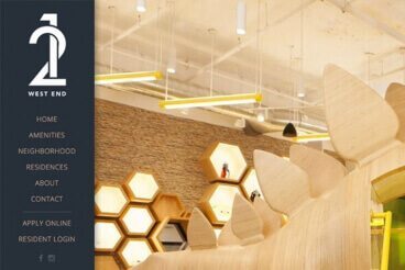
There’s a trending topic in website design navigation: sidebar menus. More designers are working with vertical side navigation for projects, with a specific location on the left side for many of these website designs.

And while it looks nice and can help streamline clutter in the overall canvas, does it really work? Will users respond to side navigation? Is it a design trend that you should consider? Today, we’ll try to get to the heart of the questions with some practical and usable answers.

How to Add Touches of Magic to Your Interactions

CSS / 3 May 2017

How to Add Touches of Magic to Your Interactions

Every time a user does something with your design, an interaction is created. Some interactions, such as clicks, go almost unnoticed by the user. But other interactions include a certain bit of magic that makes the user want to play with the design even more.

There’s a fine line between an interaction that has the touch of magic and one that can be completely overwhelming. The most magical interactions are a bit unexpected, simple, create an emotional response and make the user want to use it again.

Design Trend: Innovative Hover Effects

Graphics / 6 Mar 2017

Design Trend: Innovative Hover Effects

Everywhere you look, there’s a cool new animated effect. If animation was the must-have design element of 2016, then innovated hover effects are the up and coming design trend of 2017.

Thanks in part to the popularity of Material Design and Apple’s animation guidelines with a focus on small movements, hover effects are making a comeback. But instead of the tacky, flashing, bouncing and spinning effects of the past, animations are simple, sharp and delightful. The best hover effects help the user and enhance the experience.

Hover effects can range from motion that has an impact on the entire screen to something as small as a directional cue or navigation element.