Mobile

Learn how to put mobile first in your designs, for phones, tablets, and wearable devices. Create responsive designs, and tap-friendly layouts!

Design Trend: Modern Tappable Targets (And How to Do It)

Mobile / 15 Oct 2020

Design Trend: Modern Tappable Targets (And How to Do It)

A solid tap target can make or break your mobile website or app. The size, shape, location, and overall design of the button or link determines whether a user successfully completes an action or not. It might seem like a small thing, but can be one of the most important elements of a design.

Modern tappable targets are easy to recognize, work in an expected manner, and encourage engagement.

Today we’re looking at how to design them, ways to craft effective call-to-action items, and considerations around color and font choices.

15+ Best Instagram Design Tutorials

Instagram Templates / 8 Sep 2020

15+ Best Instagram Design Tutorials

Get ready to up your digital marketing – or just personal profile – game with stellar design tips and tricks for Instagram.

We all know that the photo-based social media platform is so much more than images. It’s also a collection of videos, sound, and plenty of design elements to help bring your stories and information to life.

Here, we’ve gathered a collection of tutorials that will help you create amazing Instagram designs that you can use and share.

Rethinking Table Design for Mobile

Layouts / 1 Sep 2020

Rethinking Table Design for Mobile

There might be a problem with that table on your website. It doesn’t look or function well on my phone. It sounds like a simple problem (that should have a simple solution), but might not be quite as simple as you’d think.

There are a variety of reasons that could contribute to this issue – lack of responsiveness, creating tables as images, odd data formatting that makes a mess – but there are also viable design solutions.

Let’s walk through ways to rethink table design so that your data and information looks just as amazing on a phone as it does on any other larger device.

10 Tips for Designing for Wearables and Watches

Graphics / 20 Aug 2019

10 Tips for Designing for Wearables and Watches

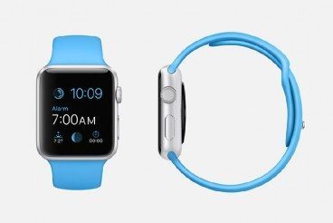
Every day, we see more and more people sporting an Apple Watch or similar. These devices are constantly changing the way we think about wearable technology and how to design websites and apps for unique interfaces.

Wearables present challenges unlike other design projects. Function is a primary concern, as is the size, with what will be one of the smallest screens designers have ever worked with.

The key is creating a design that is visually pleasing but is user-friendly and provides a functional experience.

Here are 10 things to consider as you design for a wearable interface (with examples other designers are already imagining).

10 Ways to Use Mapping in Web or App Design

Layouts / 14 Aug 2019

10 Ways to Use Mapping in Web or App Design

Almost everywhere you look these days, you find a map or location-based nugget of information. Almost every app asks for a location, and their presence is becoming more and more common on desktop websites as well.

But if you have not branched out into the world of mapping or location data, it may seem a little intimidating.

How can you effectively use mapping services for your website or app? We’ll take a look at ten ways you can integrate a map today.

Mobile First Design: Why It’s Great and Why It Sucks

CSS / 23 Jul 2019

Mobile First Design: Why It’s Great and Why It Sucks

Historically, most web designers and their clients have approached the desktop side of any project first, while leaving the mobile part as a secondary goal that gets accomplished later. Even with the rise of responsive design, many of us begin with the “full size” site and work our way down.

There’s a growing trend in the industry though to flip this workflow on its head and actually begin with mobile considerations and then work up to a larger desktop version.

Why would you ever approach a project this way? What are some of the pros and cons of this strategy? Read on to find out!

Phones Keep Getting Larger: Here’s How to Design for Them

Mobile / 11 Mar 2019

Phones Keep Getting Larger: Here’s How to Design for Them

Phones keep getting ever-larger, there’s no denying it. Looking back at the original iPhone today, it seems incredulously small. But large phones come with new design considerations and requirements. Let’s dive into them.

The highly anticipated Samsung Galaxy S10 5G comes out later this year. If your website design ready for it? The phone will feature a massive 6.7-inch display — the iPhone XS Max comes in at 6.5 inches, and many common devices are 5.5 inches or larger – making it important that you are creating something that renders well on what we used to call “phablets.”

Here are a few considerations to keep in mind when it comes to designing for phone screens that just seem to keep getting bigger.

10 Tools & Apps for Testing Your Responsive Design

Mobile / 21 Nov 2018

10 Tools & Apps for Testing Your Responsive Design

It’s never been more important to ensure your design is ready for every type of user—and device—before launch. While it can be tough to physically test on every device, there are some tools and apps to help you replicate a variety of responsive scenarios.

With free and premium tool options, there’s no reason not to test your responsive design before deployment. Just make sure to use that information to many necessary design adjustments! Today we’re running you through a selection of tools for testing a responsive design.

8 Rules for Creating an Effective Responsive Website or App

Layouts / 5 Nov 2018

8 Rules for Creating an Effective Responsive Website or App

Users are spending a lot of time interacting with websites on mobile devices, rather than desktops. And that number seems to be growing daily. According to eMarketer, adults in the U.S. spend an average of 3 hours and 35 minutes on their phones, and the amount of time engaging on these devices is expected to pass TV viewing next year.

That has significant implications for all web designers and developers. You must be creating effective responsive websites or apps to meet this need. Today, we’re exploring eight rules to make sure you follow whenever you’re designing a responsive experience (whether for a website or an app).

What’s a Progressive Web App (And Why Should You Care)?

Mobile / 10 Oct 2018

What’s a Progressive Web App (And Why Should You Care)?

In 2016, mobile users first surpassed those accessing the web from desktop devices. Since then, mobile hasn’t shown any signs of slowing down.

As everyone looks for how to make websites, and web apps, more mobile-friendly, you’ll increasingly start to come across the phrase “Progressive Web App”. Today we’re looking at what this is, how it differs from other technologies like AMP, and how you can get started.

5 Fun Augmented Reality Apps for Design Inspiration

Mobile / 21 Feb 2018

5 Fun Augmented Reality Apps for Design Inspiration

Augmented reality is a growing trend in application design and development. Apple has invested in the technology with recent updates (ARKit), and plans to include even more AR features. So how do you start planning to design for augmented reality?

It starts with playing with apps already on the market to see how they work. What do you like (or dislike)? Here are five AR apps to help jumpstart your design inspiration and hopefully get you thinking about this next generation technology. (And how to make it look great and function well.)

7 Tips for Designing for Oversized Touchscreens

Mobile / 15 Jan 2018

7 Tips for Designing for Oversized Touchscreens

Touchscreens are everywhere. But they aren’t just on your phones and tablets. Designing for the oversized versions of touchscreens – think desktop computer size and larger – can present a unique set of challenges.

How do you design for something so big, when you are so accustomed to thinking about thumb regions for screen design? Here’s a guide to thinking about oversized touchscreens and how to create something that users with interact with on an even larger touch scale.