How to Design a Paywall That Visitors Will Pay to Pass Through
Everything you create online has to have value for the user if you want them to engage with it. This is most important when you are asking visitors to give you something in exchange for content.
Whether your paywall asks for direct payment or just an exchange, such as pay with a tweet, the method you use in creating a paywall can be a factor in the success of subscribers or paid entries.
Here, we’ll look at different paywall options and value propositions you can use to help encourage visitors to pay to play on your website or mobile app.
2 Million+ Digital Assets, With Unlimited Downloads
Get unlimited downloads of 2 million+ design resources, themes, templates, photos, graphics and more. Envato Elements starts at $16 per month, and is the best creative subscription we've ever seen.
Start with Realistic Expectations
Most people go into a website or app with a paywall from one of two mindsets: Start with a paywall from the beginning or add a paywall to existing content.
It can be a tough sell to add a paywall after something has been free unless you are adding plenty of content or features.
It can be equally tough to start with a paywall out of the gate if people don’t know what to expect.
Because of this, most teams opt for a soft paywall that allows access to some features or content to help build trust and the need for additional information. This is a common method for apps and games, where you can unlock features, levels, or avatars or play without ads if you pay. This is referred to as a freemium model.
Other soft paywall options include metered paywalls and dynamic metered paywalls.
- Metered paywalls give you a certain amount of free content and then require payment, such as being able to read so many articles on Medium per month for free.
- Dynamic metered paywalls do the same things as metered paywalls but tailer the amount of free content to the user with a script that tracks usage and behavior. This is most common with gaming apps.
The one thing that’s important to understand about all paywalls is that in exchange for payment, there are some things you will give up as well. Traffic will decrease as will social sharing.
On the other hand, a paywall can help you create a more loyal community and fanbase that desires your content and information to the degree that they actually pay for it. To ensure that content is of value, it needs to be unique and special, desired by the audience, and evolve/change enough to justify continued payment.
Think so some common apps with paywalls that you use all the time and the value they provide – Spotify, Netflix, newspaper or magazine subscriptions, almost any app-based game.
Use Strong, Descriptive Imagery
When designing the elements of a paywall for your website or app, it is important to think about what the screen looks like that offers a value proposition so that users will want to get what’s behind the payment option.
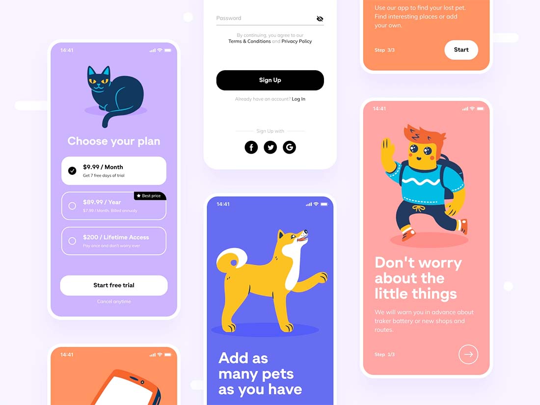
As with almost any other type of design, that starts with a strong visual. Show something that’s representative of what you have to offer or a peek at what’s behind the paywall.
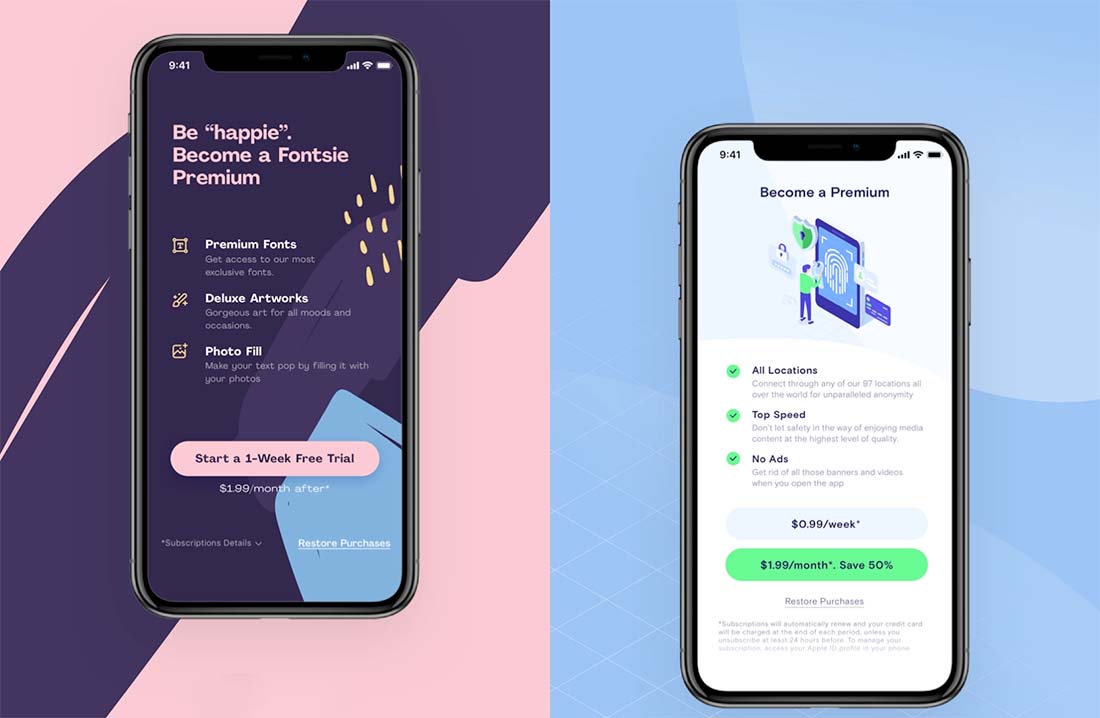
Use simple and descriptive imagery that’s easy to understand at a glance. If you don’t have an image or illustration, pricing graphics are another option for a visual that helps provide understanding.
Explain the What You Get
What value is behind the paywall? It’s important to outline value, features, and everything you get for becoming a one-time buyer or subscriber.
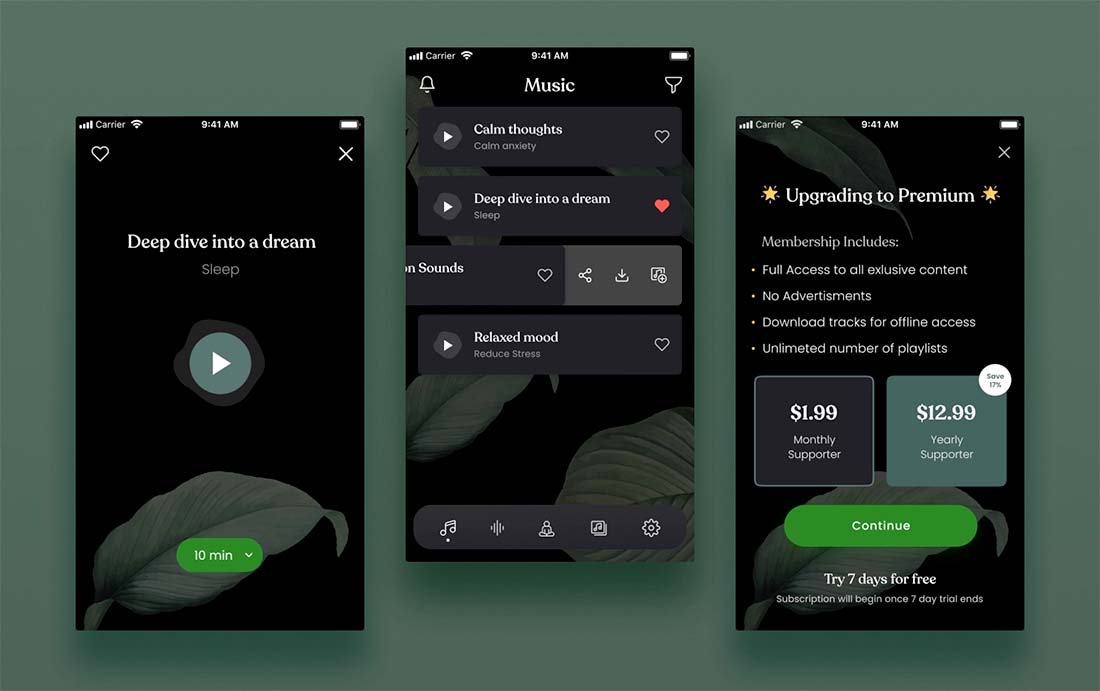
Most paywalls offer one or two options for subscription-based plans: A basic option with a few premium features and an unlimited or lifetime option that includes everything. If the difference in price is fairly minimal, many users will take the upgrade with this model if you do a good job explaining the additional value.
Some of the examples here show this in action; note the screen that shows what membership includes above with two options. The only difference is the duration of the plan and the discount that comes with it.
Show Transparent Pricing (And Maybe a Promo)
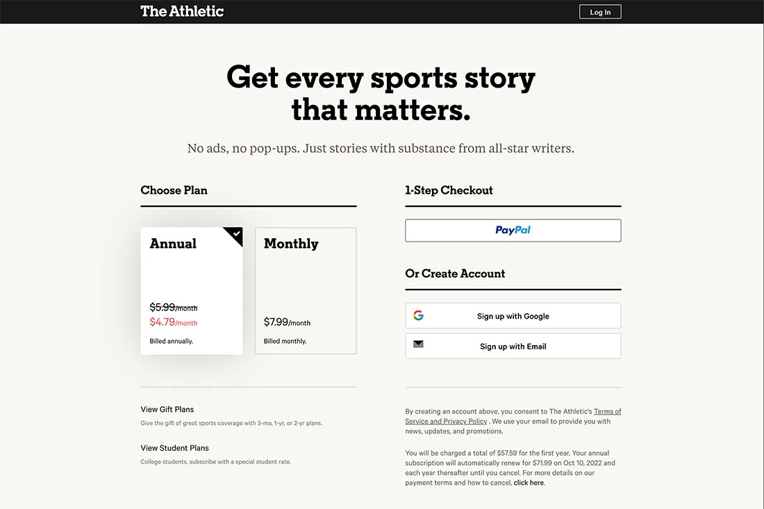
In addition to value, it’s important to offer transparent and easy-to-understand pricing. While most paywalls start with a promo or intro offer, you need to clearly explain actual pricing and renewals.
The most common pricing and promo options include:
- Free trial for a limited time and then pay for the app or website
- Pay as you go or up front for a specified time period or amount of use
- Subscription with renewal at a specified time
- Lifetime or one-time price
There are also paywalls and pricing models that allow to you pay with something other than money. This option can be appealing for lower-value items or brands that are trying to build a following.
Pay with a Tweet has been a popular social sharing payment option. Others include the ability to enter a paywall by liking something, entering information in a form, or sharing the app with someone via email. Some of the programs even have multiple product tiers based on shares and engagement.
If actual cash payment isn’t working for you this can be an option to try.
When it comes to full transparency, make sure to always include the following information:
- Price
- Intro or promo offer details or terms
- Length of the billing cycle and how renewal works
- Contact for support or help
Use a Big Button
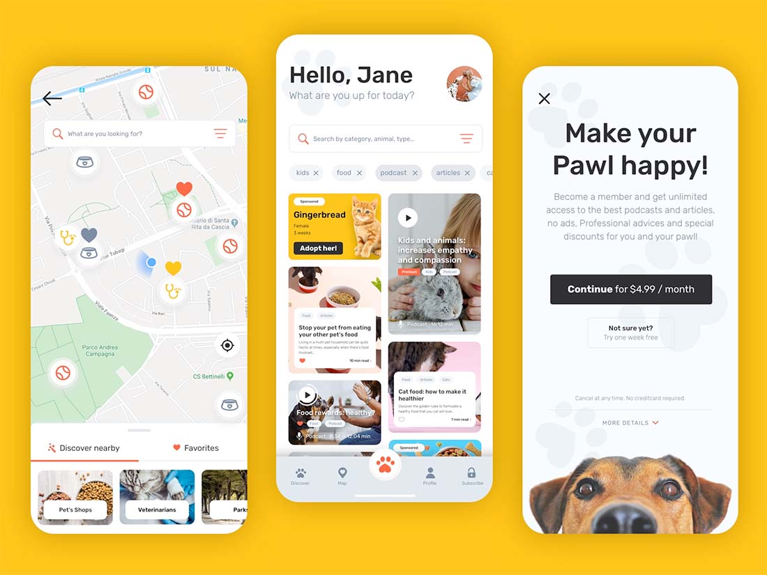
Make it easy for potential subscribers or customers to get through your paywall with a big, easy-to-see button that begins the process to get access. Label the button clearly so that users know exactly what will happen with a click.
You’ll probably see a lot of them out there, but avoid dark patterns here. Don’t trick users into starting the signup process. That will only frustrate them and turn them away.
If you require a credit card or payment upfront (even for trials) make sure to clearly state that information as well.
Everything surrounding the big call to action button should describe what happens next and what the cost of entry truly is.
Incorporate Social Proof
The concept of Pay with a Tweet was made so popular because of the element of social proof. By sharing the purchase of an app or font or website access, users were introducing that thing to their networks. Those people potentially saw that tweet or other share as an endorsement and may have also sought additional information.
Even if your paywall isn’t designed to pay with social proof, you can still include opportunities for your fans to share. All you have to do is ask.
Another social proof option is to include testimonials or reviews on the landing page with information on the outside of the paywall. Others may use this to help them make a choice before committing to payment.
Reiterate the Value Proposition
You can’t tell users too many times why your app or website is worth the payment. Help back up that valve proposition with incentives as you explain more about the content you are offering.
Use words and phrases with your value proposition that make users feel of sense of urgency to sign up (“limited offer”), special pricing, scarcity (“only 10 left”), or social incentives (“every purchase supports a shelter animal”).
All of these elements draw on user emotion and desire in the path to committing to pay for what you are offering.
Have a Backup Plan/Page
When all else fails, make sure you have a backup plan. Create a page that gives people who decline to enter the paywall a second option. This page might include more information about terms or benefits, an FAQ, or screenshots, or images of what’s behind the paywall.
Sometimes the backup plan page also includes an additional offer or discount. This is your last opportunity to help convert this free user to a paid one.
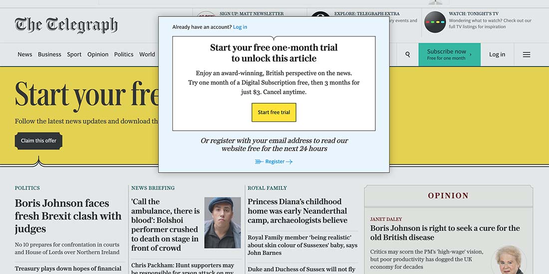
Note in the example above the primary paywall is a popup that appears over the content. (You can still see just enough to determine if you want to unlock the free trial.) Then there is a large banner across the top of the page as well that gives users a second chance if they don’t take advantage of the popup.
Providing multiple opportunities to get behind the paywall can be a solid strategy if you allow some of the website to be open to all. This can help those visitors that are on the fence get back to the paid version/option if they want to.
Conclusion
Designing a functional paywall includes both visual elements – use everything you know about good design here – and transparent pricing and functionality. Asking a user to pay for content or additional features can be a big ask; make sure that what you offer behind the paywall is worth it for them.
Remember to provide as much information as necessary for users to make a decision and reiterate your value proposition throughout the design.

