How to Design a Brochure
In the digital era, where everything happens online, flipping through the pages of a real brochure to learn about a product or a business can deliver a unique experience to your target audience while helping you to stand out from the crowd.
If you’re planning on creating a brochure for your business, company, or product, we’re here to make that process easier for you.
In this comprehensive guide, we’ll walk you through the entire process of how to design a brochure. From picking the right format and planning according to your budget, to choosing a printer, to creating the finished product.
Let’s get started!
Introduction

There are many different types of brochure out there. It’s important that you understand what they are so that you can figure out what kind of a brochure you want to create yourself.
What Makes A Great Brochure?
“There are three responses to a piece of design – yes, no, and WOW! Wow is the one to aim for.” – Milton Glaser
Designers are often encouraged to be creative and go where their imagination takes them. However, when creating standard print designs such as brochures, you have to follow a certain set of specifications to make your brochure more consistent.
There’s a reason why most print documents like books, newspapers, and brochures have been designed the same way for hundreds of years. Consistency is an important part of providing a better user experience.
A great brochure should have one goal: educate your target audience.
Whether it’s to showcase your company, explain a marketing plan to your sales team, or even promote your products at an event, a brochure can be a great educational medium that delivers powerful results.
Here are some of the key elements of a great brochure design:
- An attractive and modern design
- Uncluttered content design
- Written with simple language
- User-friendly paragraph and content arrangement
- Use minimal colors and images
What Does a Brochure Design Cost?
Depending on the purpose of your brochure and your current budget, there are several different ways you can design a brochure.
Design It Yourself: With the help of brochure templates, you can actually design a brochure all by yourself for less than $20 without any design knowledge. All you’ll need is Adobe InDesign or Photoshop to open the template and edit it
Hire a Freelancer: If you don’t have the time to design a brochure yourself, you can hire a freelance designer to do the job for you. Depending on the type of brochure you’re designing, it could cost around $100 to $400 (sometimes more) to hire a freelance brochure designer.
Hire a Design Agency: If you’re designing a brochure for a corporate company or a brand, you should consider hiring a design agency. It could cost around $1000 to $2000 or more to hire an agency to design a simple tri-fold brochure. Again, it will depend on the quality of the agency and the type of brochure you’re designing.
Use an Online Tool: You can also use an online tool to design your brochure. These tools are fairly easy to use and come with free templates. If you’re designing a simple flyer or a leaflet, this is a good option. However, it’s best not to use free online tools for professional and business projects as the templates are used by thousands of other people.
In this guide, we’ll focus on helping you design a brochure by yourself.
Brochure Formats & Specifications
When talking about brochures, a few different types of documents come to mind:
Brochure Documents
These are the multi-page documents used for making detailed documents such as annual reports, company profiles, product catalogs, etc.
Bi-Fold Brochure
This is a single page document that can be folded to make it easier to read. Commonly used to promote products, services, and brands.
Tri-Fold Brochure
Tri-fold brochures are similar to bi-fold, except folded by three parts.
Pamphlet (A Flyer or Leaflet)
A pamphlet is a single page brochure that can be used to promote products as well as educate audiences. Pamphlets can also be made in bi-fold and tri-fold designs.
The size and specifications of a brochure document such as a company profile, business report, or most multi-page documents are usually either done in A4 or US Letter size. It’s also common practice to leave a bleeding area for the document as well.
Overall, the size of a brochure is measured 210 x 297 mm with 3 mm bleeding area for A4 size and 8.5 x 11 inch with 3 mm bleeding for US Letter.
Brochures can be created in both portrait and landscape designs. Also, you can make square-shaped brochures in A5 size.
Best Practices for Brochure Design
Designing a brochure is not that difficult. But designing a great and effective brochure takes careful planning and creative thinking. These tips will help you get a head start.
Use a Consistent Design Style
Sticking to a consistent style is important when designing any type of brochure. The images, fonts, colors, titles, and everything in your brochure should have a connection with each other.
A good way to come up with a design style is to think about your audience, what they like and dislike, and come up with a style to mix what your audience likes with your branding style. Then stick to that style throughout your brochure design. This applies to images too.
Write Simple and Short Sentences
Unless you’re designing a brochure for a group of college professors, you should always stick to a simple and friendly writing style in your brochure.
Avoid big dictionary words and write in short sentences. In short, write like you’re talking to a friend. This way your audience will find your brochure more relatable.
Format for Skimming
Newspapers are going out of business for a reason. No one wants to read long paragraphs of text anymore. They would rather open Facebook and scroll through the news headlines.
Make sure to avoid long paragraphs in your brochure. Use lots of bullet points as well as headings and subheadings to make it skimmable.
First Impressions Matter
It only takes less than a second for someone to judge your business or brand based on your brochure. They’ll take a short glimpse at your brochure cover and determine whether they can trust your brand or not.
Aim to make a great first impression. This means designing a great cover for your brochure document or a front-page for your foldable brochure.
Make it Worth Keeping
You shouldn’t focus on making just a good-looking brochure. But aim to leave a lasting impression. Depending on the type of brochure you’re making, there are various strategies you can use to achieve that goal.
For example, you can team up with a business to add a coupon code to your pamphlet or flyer. So that your audience will keep your flyer instead of just read and throw it away. Or you can add a quiz in your brochure documents to make it interactive. Or add a list of useful daily hacks on the other side of the flyer.
Planning Your Brochure Design

Planning how you approach your brochure design is arguably the most important part of the process. This is where you figure out what kind of content to include in your brochure design.
What’s Your Brochure Objective?
Get started on your planning process by figuring out the goal or the main objective of the brochure. The entire design of the brochure and its contents will depend on the goal you want to achieve.
Here are a few questions you can ask from your clients or even yourself to figure out the objective of the brochure design.
- What’s the message you want to deliver through the brochure?
- What kind of design style would fit your brand identity?
- Did you use a brochure design before and why didn’t it work?
- What’s the main focus of the brochure content? Is it to educate your audience or promote your brand or product?
Who’s The Target Customer For Your Brochure?
A buyer’s persona is a must-have element of a business marketing strategy. It helps you figure out who’s the ideal customer for your product by creating a detailed profile of your target customer.
For example, if you’re a brand selling dog food, your target customer shouldn’t be all the people who have dogs. You need to find more detailed information about your customer like age, gender, location, education, profession, the type of dog they own, the age of the dog, etc to better target the right customer.
You can actually use this same strategy to design a more effective brochure. Using all the information you have on your buyer persona, you can think about what type of fonts to use, what kind of writing style to use, and choose images that appeal to your audience.
For example, if your target customer is a 22-year-old female with high school education who owns a husky dog, you can design your brochure using a modern font with a simple writing style and include photos of husky dogs in your brochure with a more feminine design.
Where Will Your Brochure Be Distributed?
Are you designing this brochure to hand it out at an event or a conference? Or are you planning on giving it to customers who visit your shop? Or are you mailing it to your existing customers?
The way you distribute your brochure will also help determine the style and design of your brochure. For example, if you plan on sending this brochure in the mail or as a handout at an event, you need to make the brochure lightweight.
Plan how you’re going to distribute your brochure and design your brochure accordingly.
Brochure Design Inspiration & Ideas
A great way to get ideas for your brochure design is to look at the existing brochures designed by professionals for brands and companies. Here are a few ways to spy on other brochure designs.
Behance
Behance is an online portfolio platform for designers. It’s filled with all kinds of designs and projects made by professional designers, including brochure designs. You can browse Behance to find inspiration for different types of brochures.
Dribbble
Similar to Behance, Dribbble also features design portfolios and creative projects made by professionals.
Designspiration
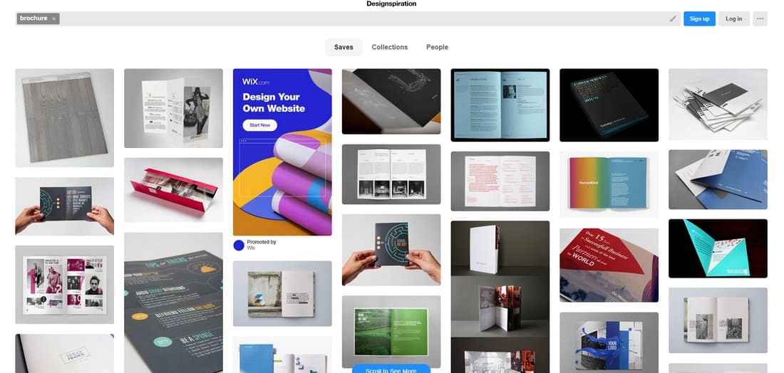
Designspiration is a site made for finding inspiration for all kinds of design work. It includes a collection of high-quality brochure designs, including printed designs and brochures made by reputable companies.
Pinterest also features a massive collection of brochure designs uploaded by its users. The site also allows you to narrow your search by different categories such as trifold, square, and other styles of brochure designs.
Envato Elements
Envato Elements is a marketplace full of design templates. You can search the site to find specific types of brochure design templates and download and use them with your own projects.
Designing Your Brochure

“Digital design is like painting, except the paint never dries.” – Neville Brody
Now that you know how to properly prepare to craft a brochure, let’s get started on the fun part of the process: designing the brochure.
Choose Your Brochure Size and Format
Just as we talked about in the brochure formats and specifications section, there are many different types of brochures you can design depending on the objective and the products you’re promoting. Now, it’s time to choose.
- A4 Brochure Size: 210 x 297 mm with 3 mm bleeding area
- US Letter Brochure Size: 5 x 11 inch with 3 mm bleeding area
- A5 Brochure Size:8 x 8.3 inch with 3 mm bleeding area
- Square Brochure Size: 8 x 8 inch with 3 mm bleeding area
It’s up to you to decide which format you’re going to use and how many pages you’ll include in your brochure. But, when in doubt, go with A4 size.
Brochure Templates vs. Designing From Scratch
Designing a brochure from scratch takes a lot of work. First you need to prepare the design layout, make a mockup design, plan content arrangement, and much more. Using a template will help you save a lot of time and money that goes into that design process.
You can actually download a premium brochure template designed by a professional for less than $20 and edit the template all by yourself using Adobe InDesign or Illustrator to quickly put together a high-quality brochure without an effort.
These brochure templates come with effective content arrangement designs, which you can click to edit and paste your own text and includes image placeholders to let you simply drag and drop to replace the images with your own.
Here are a few examples of great brochure templates.
Corporate Brochure – InDesign & Word
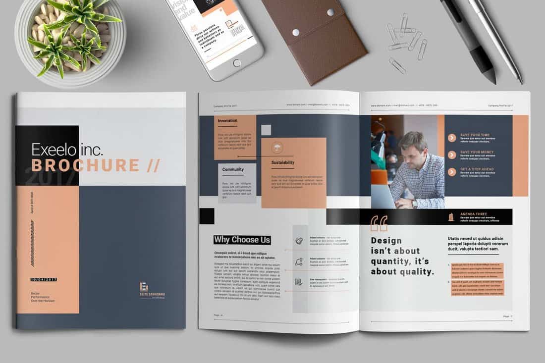
Exeelo Modern Brochure Template
Company Profile Brochure Template
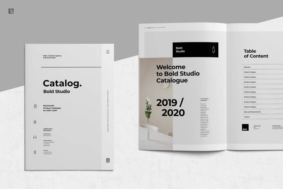
Product Catalog Brochure Template
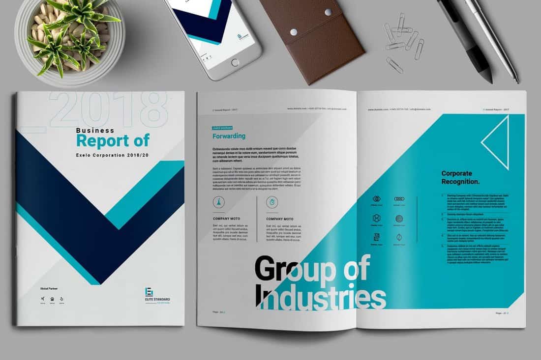
Business Report Brochure Template
However, if you’re working on a brochure for a corporate business to print thousands of copies and send out nationwide, it’s best to hire an expert and invest in a unique brochure design.
Pick (Just A Few) Fonts
Readability is the key to making a successful and effective brochure design. Since your brochure consists mostly of text content, you need to be very careful when it comes to choosing the right font for the design.
A sans-serif font would be the ideal choice for a brochure design since it’s proven to improve readability and it’s also the best type of font for general audiences. Although, if you’re a more high-end or luxury brand, a serif font is a more suitable choice for you.
Whichever type of font you end up choosing, don’t make the mistake of using lots of fonts in your brochure design. As a rule of thumb, stick to no more than 2 fonts (one font for titles and the other for body text) to ensure consistency and better readability throughout your brochure design.
Here are a few great fonts you can use with your design.
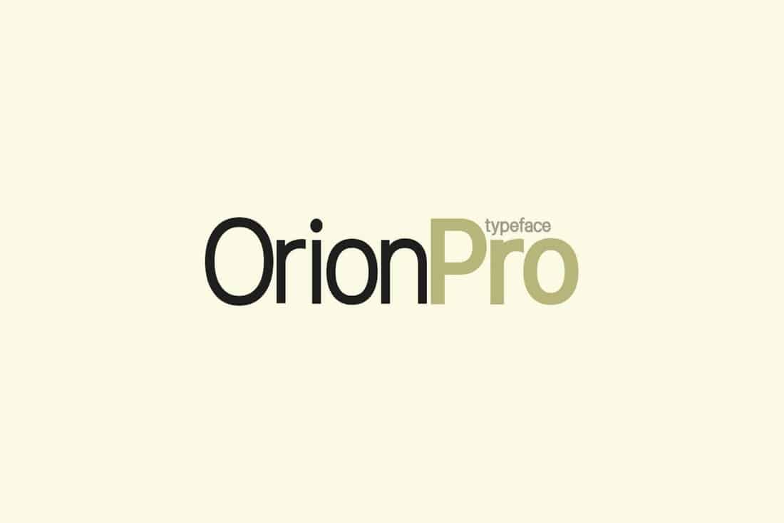
Orion Pro Modern Sans-Serif Font
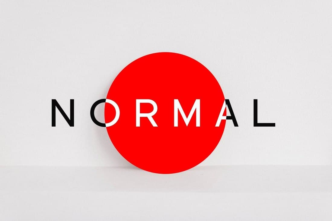
NORMAL Minimal Sans Serif Font
Tip: Depending on the brochure you’re designing (eg: tri-fold or multi-page), test different font sizes that fits the design. Avoid using larger font sizes.
Write Your Brochure Copy
“Socrates said, “Know thyself.” I say, “Know thy users.” And guess what? They don’t think like you do.” – Joshua Brewer
It’s very important to have your brochure copy prepared before you start designing the brochure.
Whether you’re designing a brochure from scratch or using a premade template, you should design your brochure page layouts according to the copy and the content. Not the other way around.
Follow these rules when writing the copy.
Use a Simple & Friendly Writing Style: It doesn’t matter if you’re writing for an audience with graduate-level education or a 15-year-old teenager, you should write your copy using simple and easy-to-understand words. To improve readability, try to write your brochure like you’re speaking to your best friend.
Edit Ruthlessly: A brochure design has very limited space. Even though you want to talk about all the great features of your product or service, you shouldn’t. Edit out all the filler content and unnecessary features until only the best part of your business or product remains on each page.
Integrate Storytelling: Back in the day, brochures used to have a very technical and robotic copy. Not anymore. You can make your brochures more interesting by using the power of storytelling. Maybe include a story about how your business started or feature a real customer success story.
Write Headlines Like A Pro: Headlines are what attracts people to a page and help them decide whether to keep reading or flip over to the other page. Make sure that you craft your headlines in a way to arouse curiosity and excitement in the reader.
Keep It Simple: People have already seen all the cliched statements and claims by businesses that try too hard in brochure copy. Don’t tell people you’re the best, show it. Use simple and straightforward statements that show why your product or brand is different from the rest.
Choosing Colours, Branding, and Imagery
Depending on the type of brochure you’re designing and your target audience, decide what type of colors and images you’ll use throughout the brochure design.
Making your brochure consistent with your brand colors is important, but it’s not the best strategy to color a brochure design. It should also be relevant to your target audience and be compatible with their culture as well.
Color plays a strong role in evoking emotions in people. Unless your brand colors align well with the topic you’re talking about in the brochure, you should try to pick the right color palette for the brochure, even if it doesn’t match your brand identity.
If you want to make a compromise, go with a minimalist approach.
Also, use lots of images in your brochure to make it more visually appealing. Use these free stock image websites to find gorgeous images for your design.
TIP: Make sure to use high-resolution images of at least 300dpi to avoid blurry and pixelated photos in the printed brochure.
Have A Clear Call-To-Action
Of course, the main purpose of every brochure is to encourage people to take some sort of action, whether it’s to check out your website, give you a call, or buy a product.
Most businesses make the mistake of using the last page of the brochure as the call to action (CTA) page. You may have seen this type of brochures that keeps building hype towards the last page and then feature a tiny CTA section that people barely notice.
Instead, what you should do is to have multiple CTA pages scattered throughout your brochure. Every time you make an important point about your product or brand, include a CTA. However, remember not to cover your entire brochure with CTAs.
Your CTAs should be easy to notice as well. If you take a look at a well-designed brochure, you’ll notice that call to actions often takes entire pages but with simple action prompts. It’s the best way to grab someone’s attention.
Printing Your Brochure
“It’s through mistakes that you actually can grow. You have to get bad in order to get good.” – Paula Scher
The final stage of the brochure design process is getting your design printed on paper. While it may seem a straightforward process, it will also force you to make a few important decisions that will affect the quality of your brochure.
Choosing Paper Stock
When comparing a newspaper and a magazine, one of the first things you’ll notice is the quality of the paper. The type of paper used to print a magazine feels heavier and sometimes glossy. This is what separates newspapers from magazines and it’s what gives them the premium look and feel.
The same applies brochures. The type of paper you use to print your brochure will determine it’s quality and end result.
When it comes to choosing paper stock for your brochure, you’ll be faced with making 3 important decisions:
- The weight of the paper
- Type of the paper
- The color of the paper
Different Paper Weights
Paper stock comes in several different weights. These weights help give your brochure a thicker and heavier feel. Here are some of the common weights used in printing.
- 70 lb. (104gsm) Text
- 80 lb. (118gsm) Text
- 100 lb. (148gsm) Text
These are “Text Weight” paper used to print the inner pages of your brochure. A special type of paper is used to print the cover pages of your brochure called “Cover Weight” paper, which feels much thicker compared to text weight paper. These are the type of paper used to print things like business cards and postcards.
- 80 lb. (118gsm) Cover
- 100 lb. (148gsm) Cover
If you don’t want a card-like cover for your brochure, you can choose a heavier or a glossy paper than your inner pages for the cover.
Depending on the type of brochure you’re printing, you need to be careful when picking a paper weight. For example, if you pick a heavier weight for printing a brochure with multiple pages, it will end up feeling uncomfortable and unnecessarily heavy.
Different Types Of Paper
The next step in choosing paper stock is finding the ideal type of paper for your brochure. There are 4 types of paper used in brochure printing.
- Gloss Coated Paper: Commonly used in magazines, the gloss coated paper will give a premium and a high-quality feel to your brochure.
- Matte Coated Paper: This is the perfect type of paper for printing brochures with lots of photos and illustrations. Because the matte coating reduces the glare while also giving the paper a premium feel.
- Uncoated Paper: If you’re taking a simple and eco-friendly approach, using uncoated paper is a great choice for printing your brochure.
- Textured Paper: Textured paper will allow you to offer a unique experience to users with embossed and textured paper designs.
Using Colored Paper
Most professionals avoid using colored paper when printing brochures for businesses. But, it can be a great choice for printing single-page, bi-fold, and tri-fold brochures for making your brochures stand out from the crowd.
Keep in mind that the color of the paper you choose will also determine the colors you use for your fonts and the images you use in the design. Be sure to make this decision before starting your brochure design.
Choosing A Printer
A modern laser printer is more than capable of handling a brochure printing job, especially if you’re printing the brochure at home. However, they will only be able to handle prints in smaller quantities. Most home printers can only handle about 50 consecutive prints at a time.
If you have access to an office printer like a high volume Xerox machine, use that printer to print your brochure in large quantities.
Depending on the quality, quantity, and the budget for your brochure, you should think twice about the printer you use. Because, even if you choose to print the brochure at home, remember that toners are expensive.
5 Tips for a Stress-Free Printing Process
Before you get started on printing out your brochure, follow these tips to avoid making some of the most common mistakes.
1. Test Prints And Get Feedback
A brochure is usually printed in large quantities. This means you should always ensure your brochure design and the print looks perfect before getting started. Can you imagine how much it will cost you if you start printing 500 brochures with a spelling error?
To avoid major headaches down the road, make your first print a test print. Double check the design for errors. Ask someone else to check. And get feedback from others on how you can improve the design.
2. Plan According To Your Budget
When printing a brochure from a printing press, they usually charge you based on quantity. It will cost you less when printing more. But, since you’re doing it yourself, you need to plan ahead.
Think about how much it will cost you per a brochure to print it using your home printer. Or is it cheaper to give it to a printing press based on your quantity? Which type of paper is the most cost-efficient?
Unless you have an unlimited budget, plan accordingly.
3. Print Quality Matters
Even if you’re printing on a budget, never print in low quality.
Most household and smaller printers let you choose the output quality of your prints. It’s usually based on low, medium, and high ink usage. Obviously, the higher the ink usage, the better and more vibrant your brochures look.
4. Read The Manual
Your printer needs to be properly calibrated before you print your brochure. Depending on the weight, size, and type of paper, you should adjust your printer properly before printing.
Grab your printer manual and see how it needs to be set up for printing your brochure. If your printer maker offers customer support, reach out and ask them.
5. Be Mindful About The Fold
If you’re printing a bi-fold, tri-fold, and any type of folding brochure design, always double check for the folding positions.
If you used a pre-made template to design the brochure, you don’t have to worry about the folds since they’re already optimized for the folding designs.
Presenting Your Brochure
You should also think about how to present your designs. It’s especially important if you’re designing a brochure for a client or simply want to show it to your boss or on your portfolio.
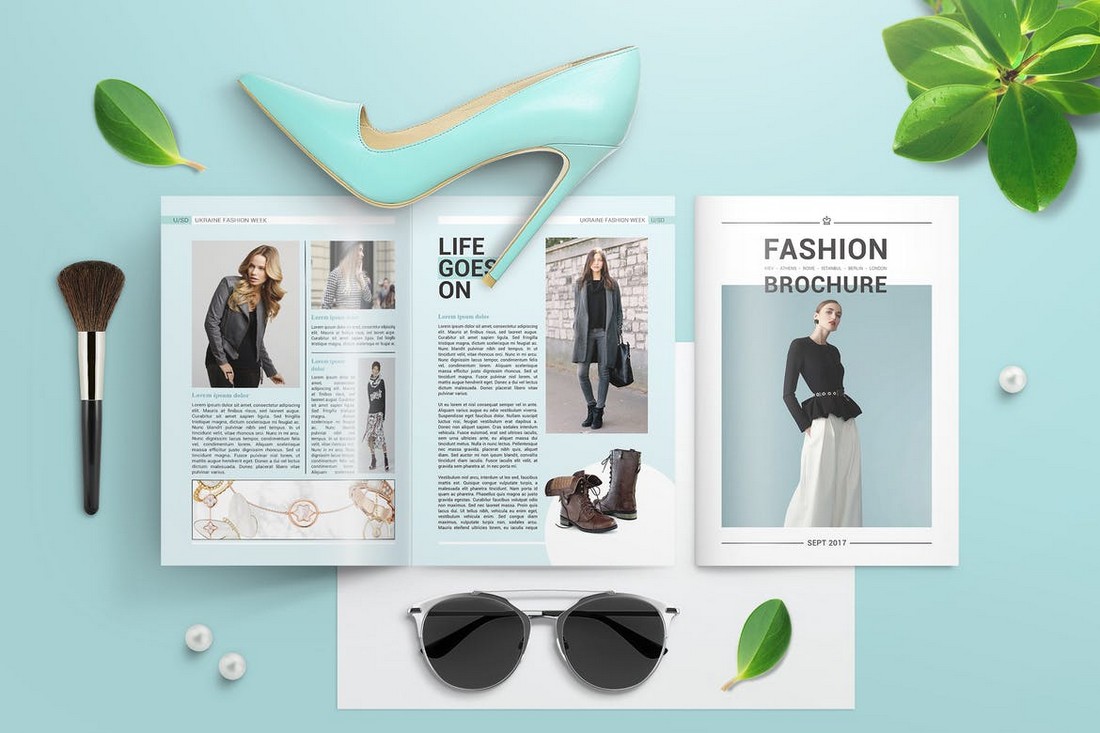
Mockups help you present your brochure designs in a professional way. They allow you to show what a brochure will look like when it gets printed. This way you can get feedback from your clients or your boss without having to print it out each time.
Here are a few great brochure mockup templates you can use to get that job done. These templates are easily editable. All you have to do is open the template in Photoshop and use the Smart Object layer to place your own brochure design.
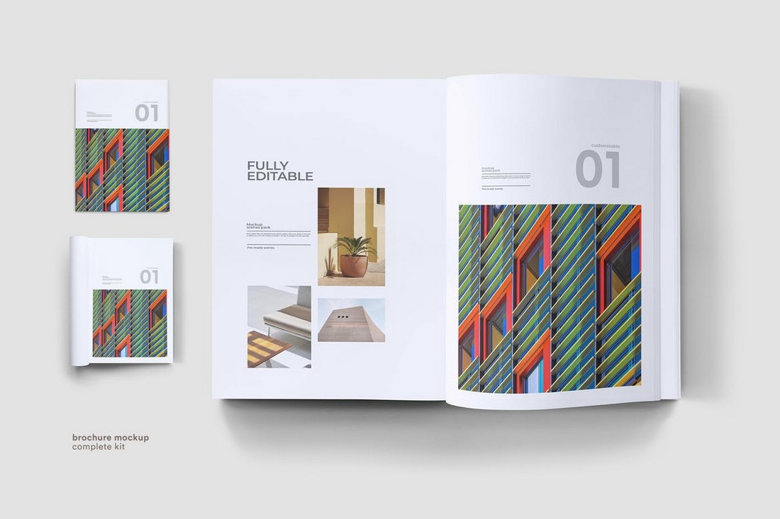
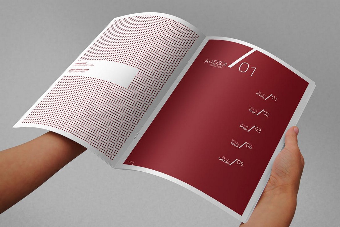
Clean Brochure Mockup
Photorealistic A4 Brochure Mockup
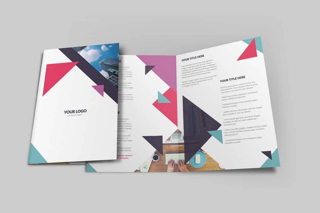
Creative A4 Bifold Brochure Mockup
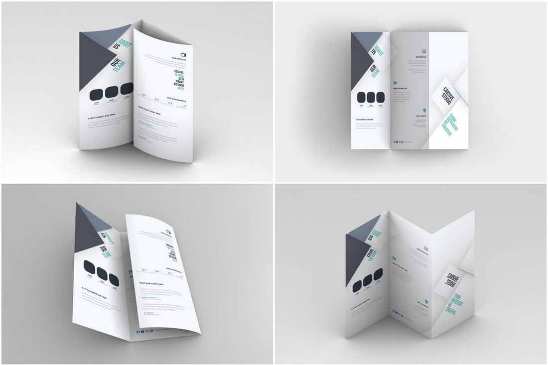
Trifold Brochure Mockup
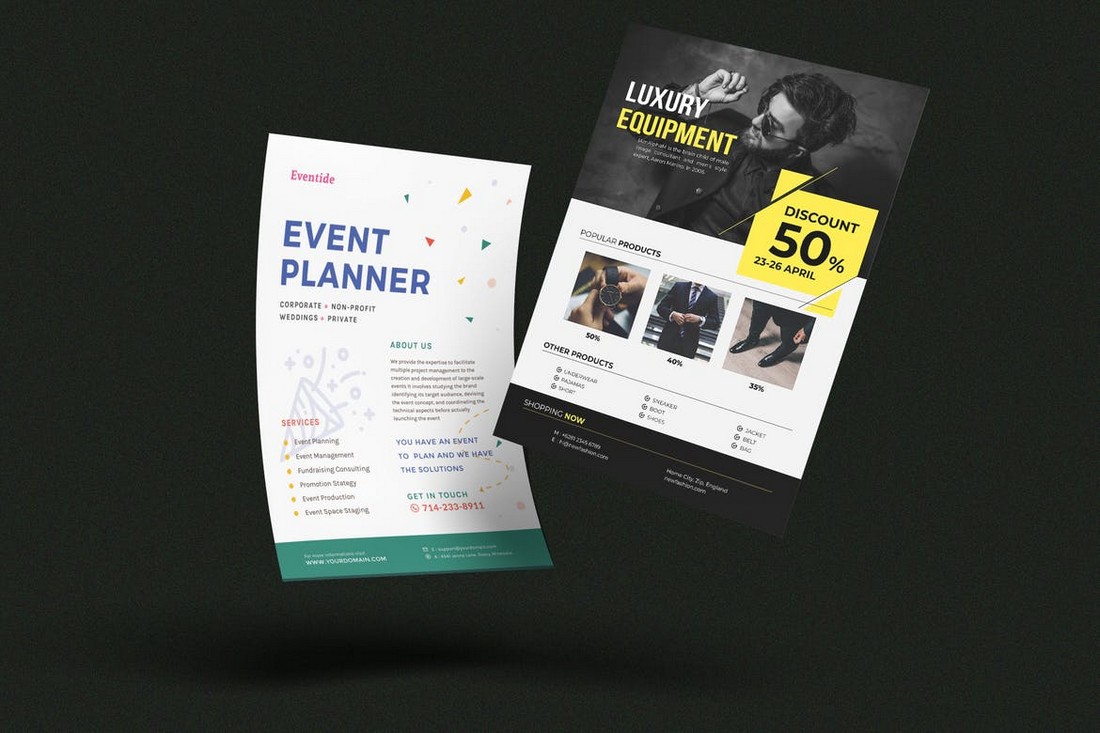
Floating Flyer Mockup
Conclusion
There are many different decisions and responsibilities involved in designing and printing a brochure. Our main goal was to provide you with a basic approach to brochure design without overwhelming you with too many complications.
We hope this guide will serve you as a resource to help you in your brochure design process and ensure a more professional and high-quality end product.
Further How to Design a Brochure Reading
18 Jul 2023
10 Tips for Perfect Brochure Design
Designing a brochure can be a rewarding project. There’s nothing like creating something that you can hold, touch, and read. Plus, the design is more than just an arrangement of parts—it includes texture and feel in a way that digital projects can’t convey.
Designing the perfect brochure can be intimidating. In addition to all the design considerations you normally think about, there are some things that are specific to printed projects.
Today we’re taking a look at ten useful tips for improving your next brochure design!
19 Jan 2023
Brochure Design Ideas & Inspiration for 2024
Almost every designer has created a brochure at some point. And there’s a strong possibility you’ll be asked to design another! Whether it’s for a client or to promote your own business, there’s an art to designing a brochure.
And then there’s an added challenge: brochure design isn’t just for print anymore. Digital brochures are just as popular as hard-copy versions. It’s quite common for clients to request a printed brochure with a digital shareable file of the same design.
Don’t sweat this design challenge though. We’ve put together some classic and modern tips so you can create a brochure design that looks great, and is easy to read.
11 Mar 2022
Brochure Design Software: 3 Options Compared
So, you need to design a brochure? Where do you start? We’re comparing three different pieces of brochure design software to see how they stack up.
For web and digital designers creating a printed brochure for the first time, to designers that have been making print pieces for a while, using the right tool can make brochure design a more efficient task.
Choosing the right software, and sticking with it over time, is a sure-fire way to speed up your design workflow.
Adobe tools are the common starting place. Today, we’ll compare using InDesign, Illustrator and Adobe Spark (a free offering) as different options creating a brochure design.
We’ll look at the pros and cons of each (including the cost), and suggest which options are best for different types of brochure design project.
12 Feb 2019
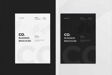
15+ Brochure Cover Design Templates + Ideas
The cover of a brochure is the most important part of the design for grabbing attention. It needs to be crafted in a specific way to suit your target audience, and these brochure cover design templates can get you off to a great start!
To help you find inspiration for your cover design, we handpicked a collection of elegant and professional brochure cover design templates that you can use to find brochure design ideas to easily make the perfect cover for all kinds of brochures.
From corporate companies to creative agencies, luxury brands, products, and much more. There’s something for any type of poster design project!
