10 Best Graphic Design Portfolio Examples + Templates
Every designer has a portfolio that acts as their online resume. It’s what you use to win clients, show off your skills, and differentiate yourself from the other designers.
Graphic design portfolio websites usually look similar. There are elements and sections that are fairly common among them. But, there are a few who go above and beyond to make their portfolios look incredible. And wow their potential clients. This post is all about those designer portfolios.
In this list, you’ll find some of the best graphic design portfolio examples for your inspiration. As an added bonus, we also listed some graphic design portfolio templates that you can use to quickly setup a portfolio website of your own.
2 Million+ Digital Assets, With Unlimited Downloads
Get unlimited downloads of 2 million+ design resources, themes, templates, photos, graphics and more. Envato Elements starts at $16 per month, and is the best creative subscription we've ever seen.
Rui Ma Design
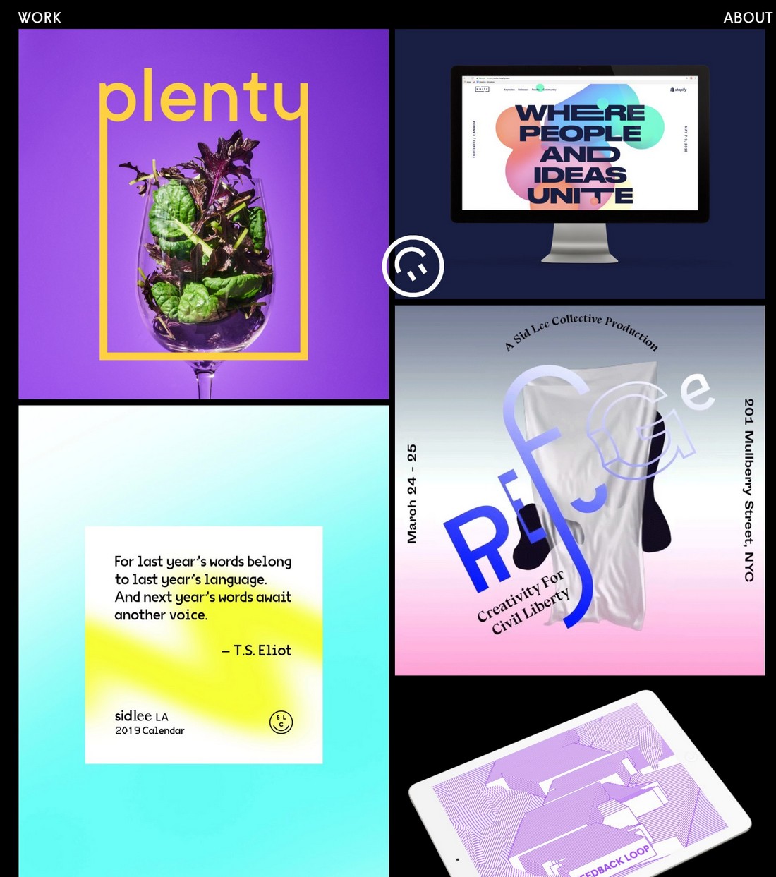
When talking about graphic design, the first thing that comes to your mind is visuals. And this design portfolio makes use of it quite well to make a great first impression.
The portfolio for the US-based Rui Ma design agency features nothing but big and beautiful visuals. The website showcase the agency’s best work in a fullscreen layout with minimum use of text.
Key Takeaways From This Portfolio
- Choosing the right images to preview your portfolio items is important
- Using big images is not enough. The way you arrange them on the website also matters
- Masonry layout is better at showcasing images than a normal grid layout
- Make sure to have just as great-looking single project page designs
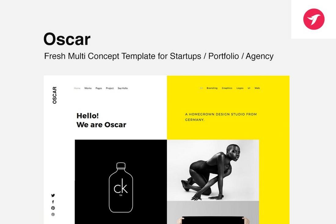
Recommended Portfolio Template: Oscar
Oscar is a modern HTML template you can use to design portfolios for agencies and startups. Even though it doesn’t look exactly like the Rui Ma website, it has all the key elements of professional portfolio design.
Lois Ansa
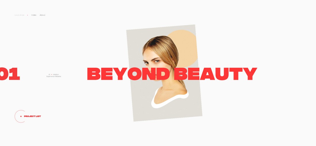
The portfolio for the French graphic designer, Lois Ansa is a thing of beauty. It’s made up of a color palette of just two colors— red and white.
The portfolio can be explored one slide at a time. And each slide is presented to you with stylish animations. Even though it uses minimal colors, the website itself is attractive enough to get you to explore the entire portfolio.
Key Takeaways From This Portfolio
- You don’t have to use lots of colors to make a design attractive
- When used properly, white space can help highlight your portfolio items
- Animations can help improve interactions
- The right font can give a bold look to your portfolio design
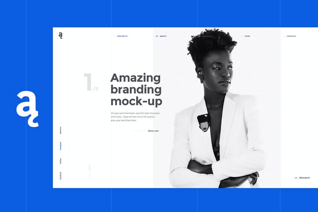
Recommended Portfolio Template: Atail
Similar to Lois Ansa’s website, Atail is a website template that also features a slide-based portfolio design. It also comes with a minimalist layout that utilizes white space quite well.
Jim Stahn
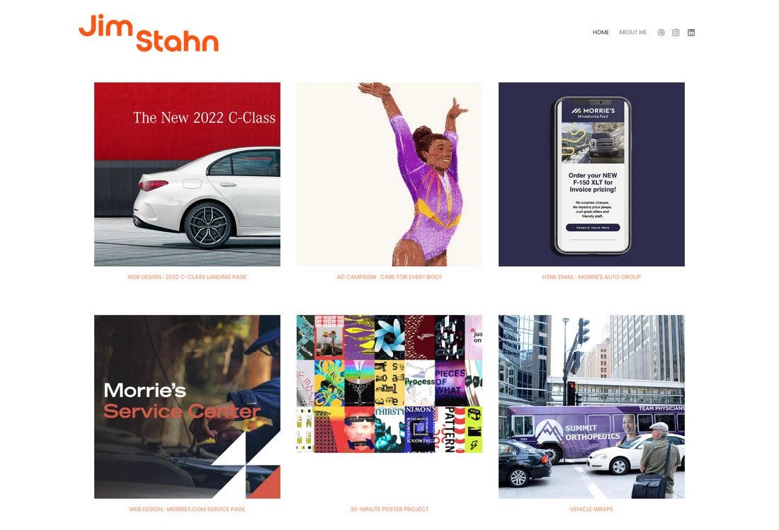
Jim Stahn’s stunning graphic design work is showcased beautifully in a grid layout website. The well-organized, user-friendly interface keeps the focus on his design work.
Jim loves building satisfying graphic design experiences and is passionate about finding exciting, imaginative ways to communicate ideas. Which is clearly shown through the portfolio design.
Key Takeaways From This Portfolio
- Minimal design highlights the portfolio items quite well
- Lightweight design offers faster load times
- Has stylish single page layouts for each case study
Recommended Portfolio Template: Pixpa
This portfolio website is built with the Pixpa online website builder. It allows you to build beautiful portfolio websites without having to worry about any coding. It includes many pre-built templates for you to choose from as well.
Cathrine.co
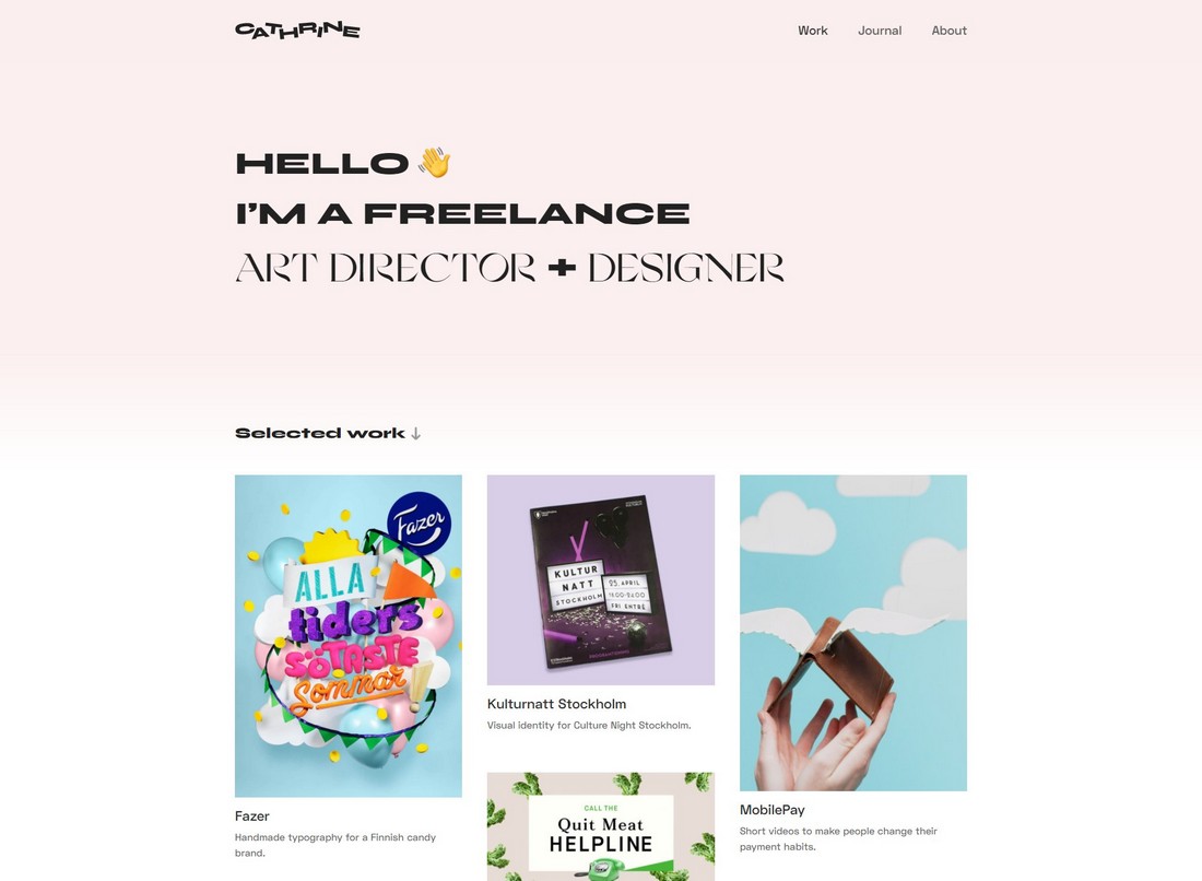
We’re not quite sure about what Cathrine was going for with the font choices. But we appreciate the use of vintage-inspired colors and the gradually fading background of this portfolio.
Cathrine Understrup is a freelance branding and graphic designer specializing in low-fi visuals. As you can see, the design of the portfolio is crafted based on the trends of the industry she specializes in.
On a side note, the use of emojis throughout the design makes the portfolio look more fun and entertaining.
Key Takeaways From This Portfolio
- A quick introduction works as a great header for freelance portfolios
- Your font choice can say a lot about your creative skills
- Don’t be afraid to use pop culture elements like emojis in your design
Denton Design
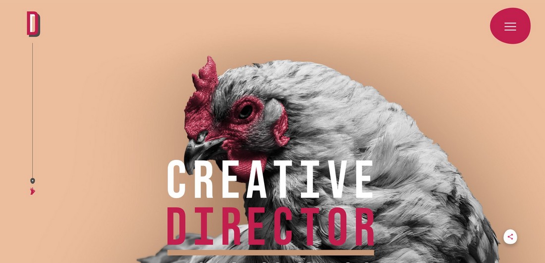
Sometimes, you can say a lot using a single image than showcasing all your projects on the website homepage. That’s exactly what Nathan Denton was going for with his portfolio website.
As a creative director who handles all aspects of graphic and web designs, Nathan was obviously aiming for a more subtle and simple design. Which is why this portfolio homepage features just a large background image with a title and a couple of links. Even the portfolio page of the website uses text titles instead of images to list the projects.
Key Takeaways From This Portfolio
- With the right background image, you can set the tone for your entire website
- Creating the site around a theme makes the portfolio look more professional
- Get creative with design elements like using egg-shaped icon backgrounds and interactive mouse cursor designs
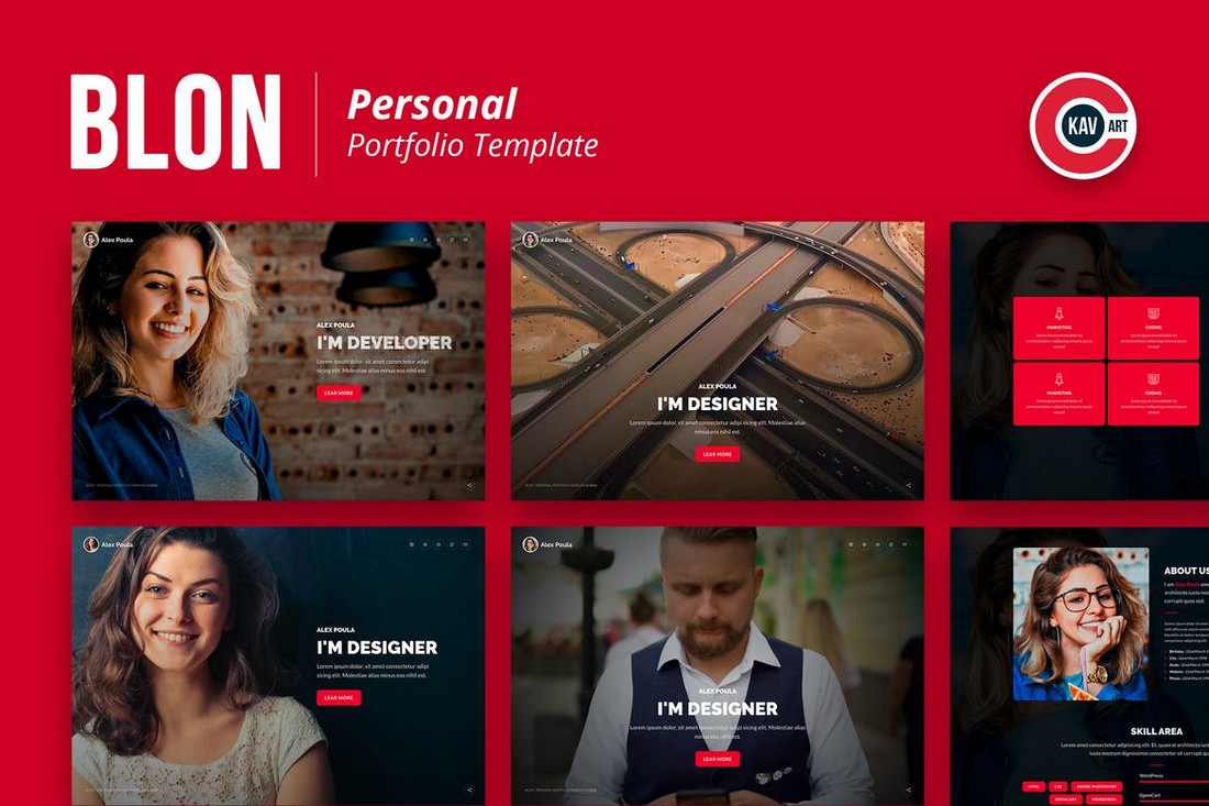
Recommended Portfolio Template: Blon
This portfolio template also utilizes big image backgrounds with bold titles. It’ll help you create a similar portfolio website with large visuals.
Another Colour
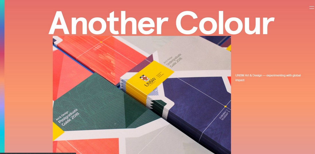
Different creatives use minimalism in different ways. Some use blank space to add a minimal look while others use minimal images and colors. This portfolio uses both.
The Australian design agency Another Colour has a portfolio website that has a very unusual style of design. It features a very simple design that uses bright and colorful gradients. It fits well with the brand name as well.
Key Takeaways From This Portfolio
- Bright and colorful gradients can help attract more attention
- There are more than one way to create minimalist designs
- Animations and effects like auto-scrolling help add personality to your site
Neuebel&Mark
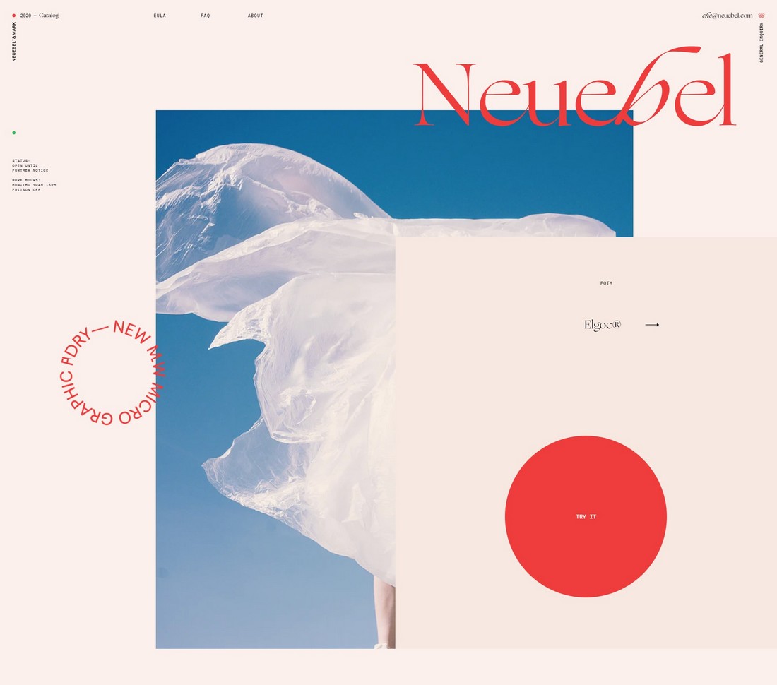
Integrating specific art styles and trends also helps make your portfolio stand out and adding a personality to your website. The portfolio for Neuebel&Mark leverage this strategy quite well.
This portfolio website uses a unique style of design taking inspiration from Art Nouveau and vintage design trends. Since the agency specializes in type design, their choice of color and layout fits perfectly with the branding as well.
Key Takeaways From This Portfolio
- Colors can be used to highlight your text and content more effectively
- Using trends is a great way to personalize your portfolio
- Get creative with the shapes and layout of the website
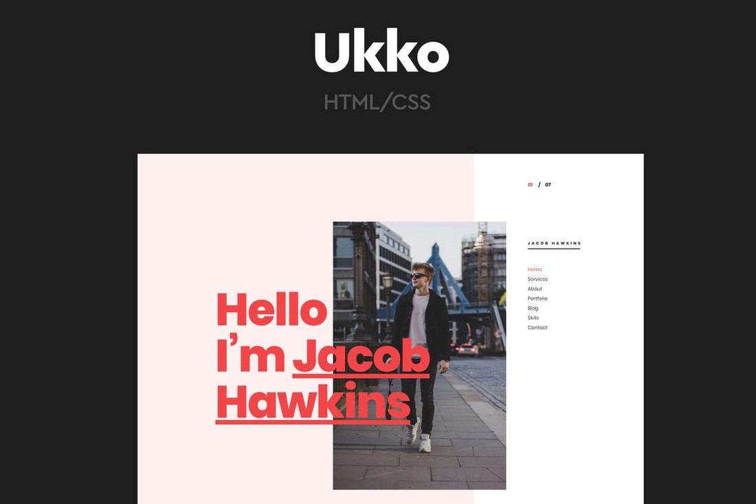
Recommended Portfolio Template: Ukko
Ukko is a portfolio template that also uses a trendy layout featuring a classic vintage design. It’s perfect for creating a freelance designer portfolio.
Samuel Scalzo
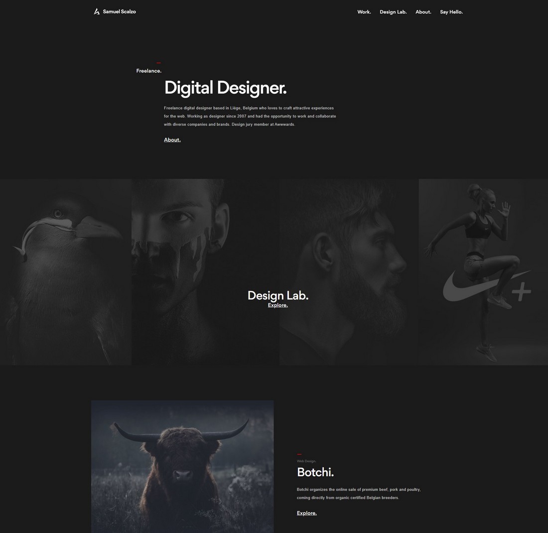
The dark color theme is a popular trend that we see all around the web. Especially with dark modes introduced to mobile and desktop operating systems, the trend is catching on quickly to websites as well.
Samuel Scalzo, a graphic designer from Belgium, also uses a dark color theme to showcase his work on the portfolio. And it seems to match perfectly with the style of his artworks.
Key Takeaways From This Portfolio
- The dark color theme is great at highlighting visual content
- Keep a minimal color palette when using dark designs
- Typography takes a bigger role in dark mode websites
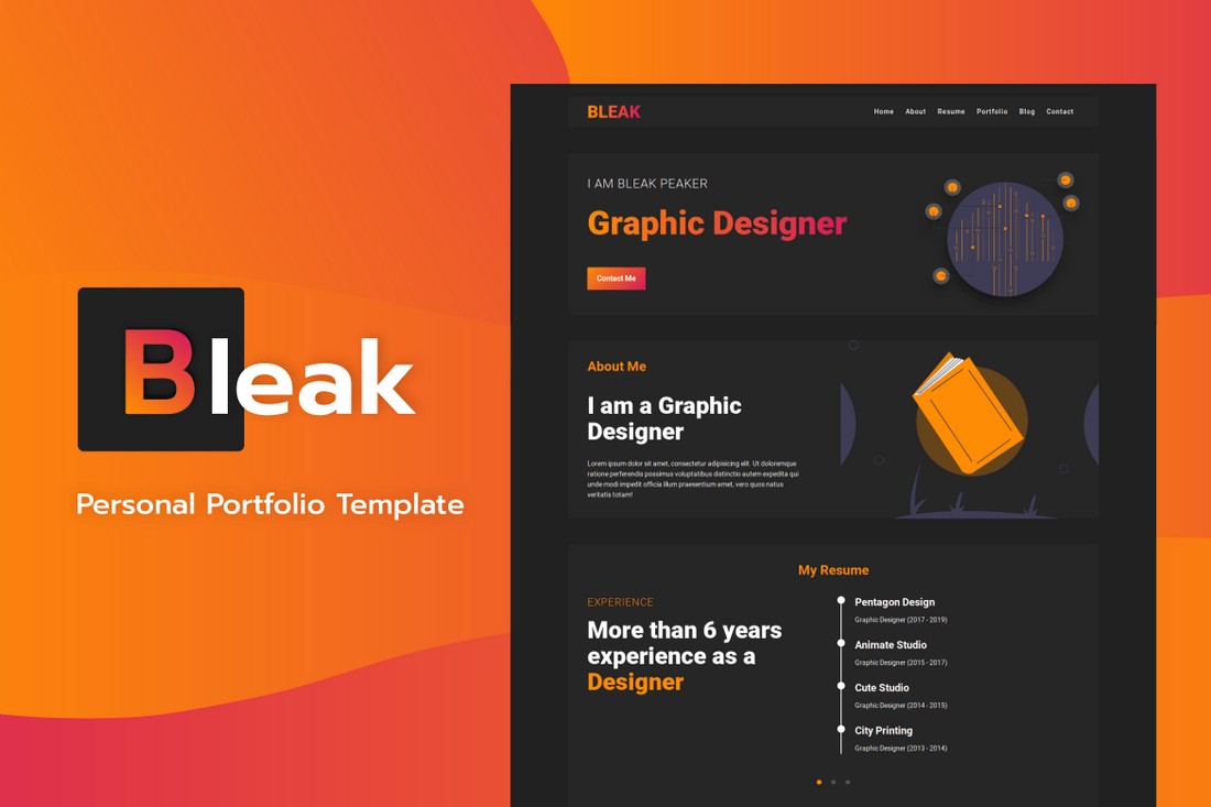
Recommended Portfolio Template: Bleak
This creative HTML template comes with a dark color theme. It’s specifically crafted for graphic designers with a modern and elegant look and feel.
Adam Sandoval
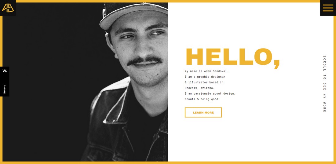
The split-screen layout is another popular style of design used in portfolio websites. This particular portfolio website uses the trend in a creative way mixed with animations to make the site experience feel like watching a slideshow.
Graphic designer Adam Sandoval uses a very clever color scheme across his website. The color yellow is often used to attract attention, according to color psychology. The design itself and the website user experience also fits well with the overall design.
Key Takeaways From This Portfolio
- Leverage color psychology to your advantage
- Showcasing portfolio items with details side-by-side helps save website space and offer a better user experience
- Big bold titles help attract attention
Recommended Portfolio Template: Aria
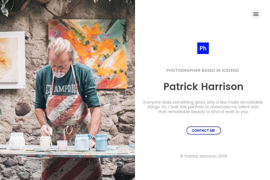
Aria is a modern portfolio template that features the same split-screen layout. Except this design has a fixed design but you can customize it to add more sections.
Studio Fables
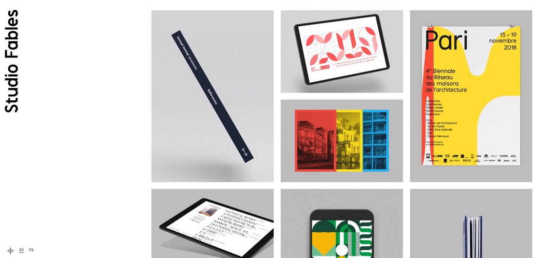
Sometimes an old-school, classic grid design is the perfect way to showcase your portfolio in a simple way. This portfolio website shows you how it’s done.
The French graphic design agency Studio Fables uses a classic portfolio design featuring a grid-based content layout. When clicking on a portfolio item, it opens up an entire page with more details about each project. It’s old-school but works quite well.
Key Takeaways From This Portfolio
- Classic layouts are perfect for simple portfolio designs
- Grid layouts help showcase more items in a small space
- You can design a great portfolio website with just one color
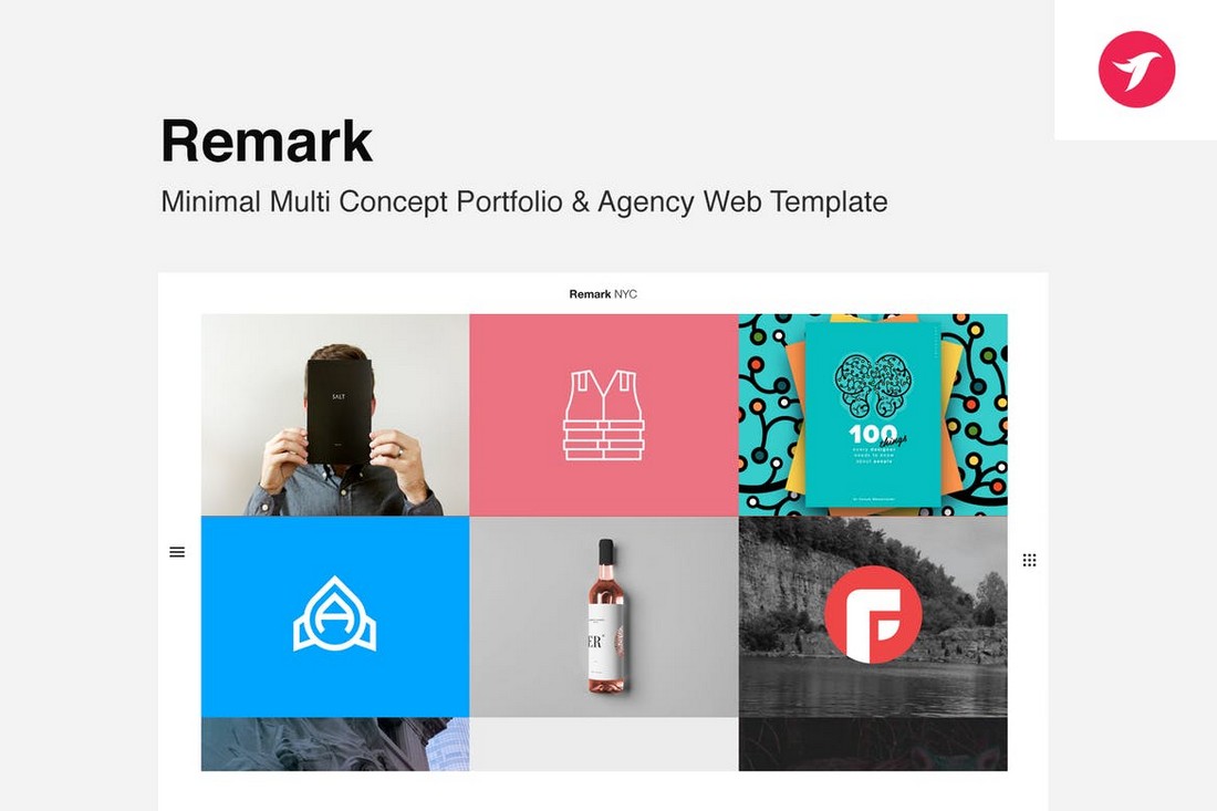
Recommended Portfolio Template: Remark
Remark is an HTML template that comes with a classic grid portfolio design. Graphic designers can use it to show off lots of images without cluttering the website.
Root Studio
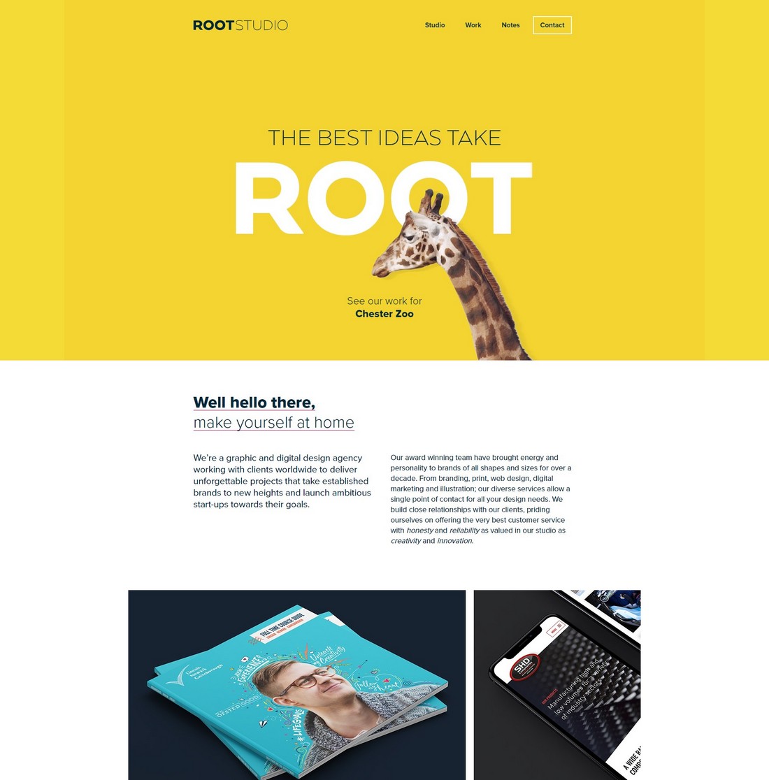
This portfolio website belongs to the UK-based graphic design agency Root Studio. At first glance, it looks like an ordinary website but it has a clever header design that makes this site special.
That Giraffe on the homepage is not an image. It’s actually a video on a loop that fits in perfectly with the website design as well as the brand. The rest of the portfolio design looks quite nice as well.
Key Takeaways From This Portfolio
- Creative header designs can make your entire portfolio look more amazing
- Bright and vibrant colors will make your designs pop
- Casual and friendly website copy can also improve the user experience
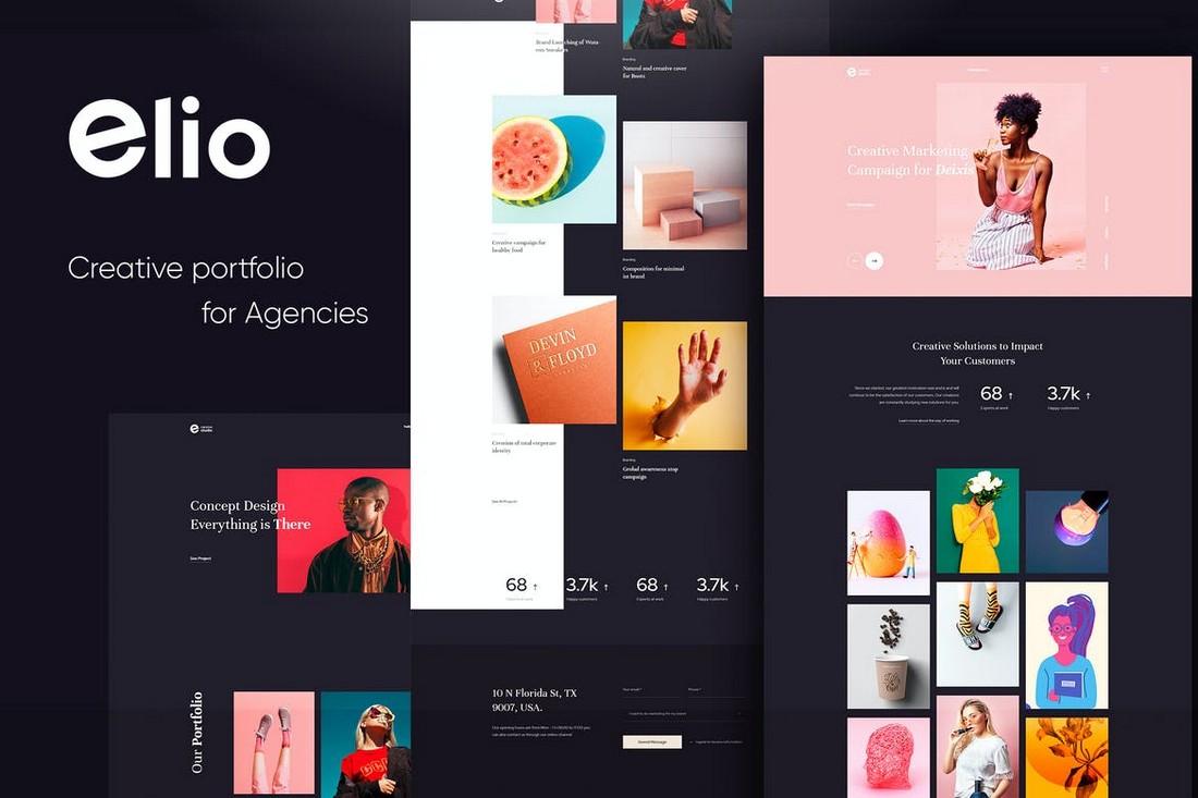
Recommended Portfolio Template: Elio
Elio is a creative HTML template for making portfolios. It may not come with animated Giraffes but it features all the perfect elements for creating professional portfolio websites.
Designing a killer portfolio website takes a lot of creative thinking. Use our tips for improving your portfolio and explore more examples in our best personal portfolio websites list.
