10 Tips for Using (And Choosing) an Email Newsletter Template
You probably know that email newsletters can be one of the most effective methods of reaching people who want to connect with your organization or brand.
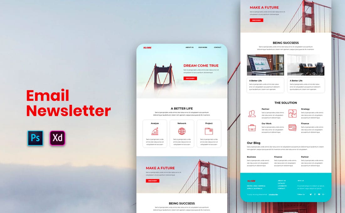
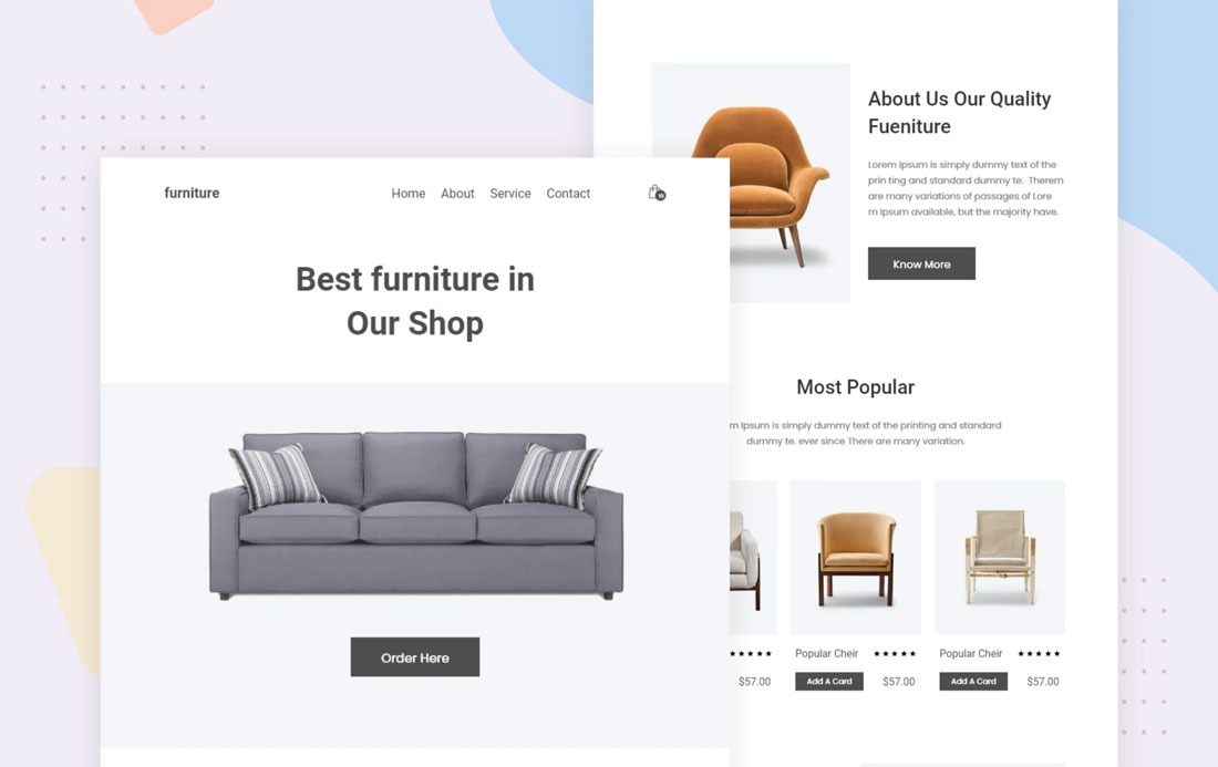
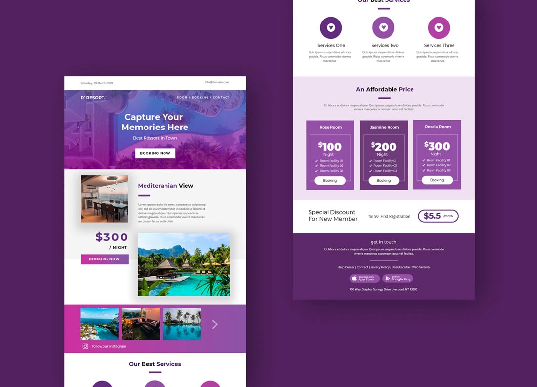
An email newsletter template can help you jumpstart the process with a semi-custom design with a visual dynamic that will keep subscribers clicking.
If you’ve never used an email template, they aren’t difficult to get to grips with. The toughest part might be choosing a design that you can customize easily and effectively.
Here are our tips for getting started!
2 Million+ Responsive Email Templates, Newsletter Templates + More With Unlimited Downloads
Download thousands of responsive HTML email templates with an Envato Elements membership. It starts at $16 per month, and gives you unlimited access to a growing library of over 2,000,000 email and web templates, design assets, graphics, themes, photos, and more.
1. Match Your Content
When looking for an email template, it is often easiest to start by looking for a template that matches the type of content you want to send out. This might be an aesthetic match or an industry match.
Some templates might even provide content ideas that you haven’t thought about.
To facilitate the process, pull together your newsletter content before looking for a template. Do you have photos? Text? Calls to action?
Look for a template that includes elements that mirror what you have pulled together. If you don’t have sharp images, for example, you don’t want to download a template that requires multiple images. Look for something a little more streamlined.
2. Include Calls to Action
Every email newsletter should encourage opens (write a great subject line) and clicks. For clicks, you need a template that includes an obvious call to action button style.
Look for buttons that stand out in the template. Bright colors, large button sizes, and buttons surrounded by white space are design elements to look for in a strong call to action.
Pair a strong button style with a link that people can’t wait to click.
3. Fit Your Brand Style
Email newsletters should match your brand style. When an email comes, it should look like other communications from your organization – from the design of the website to social media. The voice should also be the same.
Pick a template that has the same look and feel as other brand elements to create visual consistency.
4. Templates Should Work on Your Email Platform
How do you create and send emails? Any template you use should work on that platform.
Most third-party tools (such as MailChimp, Constant Contact, or Emma) allow you to create custom HTML templates. This can require a little development assistance if you aren’t familiar with the process, or vendors can do it for you.
Before loading a template to your email platform, make sure it includes everything you need in the email. It’s generally easier to delete elements than add them later.
5. Can Be Customized
Choose an email template that you can customize. It’s highly unlikely that you will pick a template, substitute the text and be ready to send.
Almost any template you select will need some work.
Make sure to adjust elements to match your brand colors, fonts, and imagery.
You will also want the flexibility to add or remove different parts of a template. The example above contains an event countdown feature. That may be something you use in some emails and not others. It’s important that you can adjust design elements in the template to fit your exact newsletter needs.
6. Feature Responsive Format

If an email newsletter template isn’t responsive, keep moving.
Most of your opens will probably happen on a mobile device. You want the email to look just as good for those users as desktop opens.
Without a responsive email template, you could severely hurt open and click-through rates.
7. Templates Should be Reusable

An email newsletter template should work for more than one send. A template should be the framework for a series of email campaigns.
Pick a style that’s flexible and that you can see using in different ways.
Email templates with plenty of whitespace can be more flexible in the long run than templates with high-design features because they won’t start to look overly familiar. More simple templates can be easier to reimagine with different content and are even quicker to build for many people.
8. Add Your Brand/Logo
Does the template include a place for your brand or logo?
Look for a top placement as well as the ability to customize your information in the email template footer. An email newsletter won’t do a lot of good for your company, blog, or organization if the people who open it have no idea who it is from.
Along those same lines, make sure to replace all of the placeholder text and elements in a template before sending it. Otherwise, you could have a pretty embarrassing mistake!
9. Include Interactive Features

Emails don’t have to be long to be impactful. Include an interactive element that encourages clicking through.
This can be anything from a button to a video link to a gif. Mix up interactive elements to keep subscribers interested every time you send a new email.
10. Align One Goal Per Email
Don’t try to cram everything into one email. Just because a template includes 10 different elements, you don’t need to use them all.
The most effective emails include one thing for users to do per email. Think about the one goal you want to meet with the email and give users multiple opportunities to meet it.
That might include multiple buttons with the same end link or an email with one click element. Focus on what you want users to do with a concise and clear message.
Conclusion
An email template is a great way to jumpstart an inbox-based marketing campaign. With so many options available – by design style or industry – you can use a template to get a campaign launched quicker than you might think.
Like the email templates you see here? You can find these and many more at Envato Elements.