CSS / 6 Mar 2012
Use Gridpak to Roll Your Own Responsive Grid
I love finding free tools that are capable of making my job (and yours) just a little bit easier. The web developer community is positively overflowing with talented people who are more than willing to share their creations with the world while asking nothing in return.
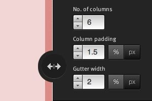
Today we’re going to look at one such tool from Erskine Design called Gridpak. With it we can quickly and easily generate our own responsive grid for building web pages that work well on lots of different screen sizes. It’s a little tricky to implement though so we’ll help you figure out how to set up your styles after you grab the download.


