105+ Best Condensed & Narrow Fonts
Maximize space without losing impact with our condensed and narrow fonts. These slim characters are perfect for tight spaces or long texts, ensuring your message is clear and legible even when space is at a premium.
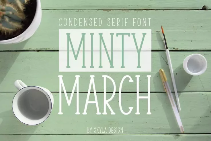
Minty March Condensed Font
This is the type of font that you usually see on greeting cards and wedding invitations. Minty March is a condensed font that also doubles as a serif ...
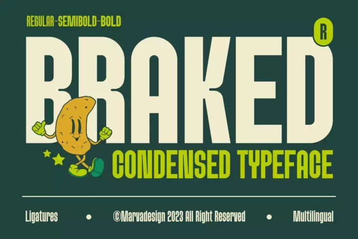
Braked Font Family
Introducing the Braked Font – A Family Sans Condensed Font. This uniquely patterned font is an artistic display of authentic designs, molded exp...
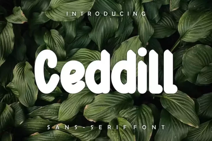
Ceddil Creative Narrow Font
Ceddil is a creative font with chunky letters. This font also has a narrow letter design that will make your poster titles and headings look even more...
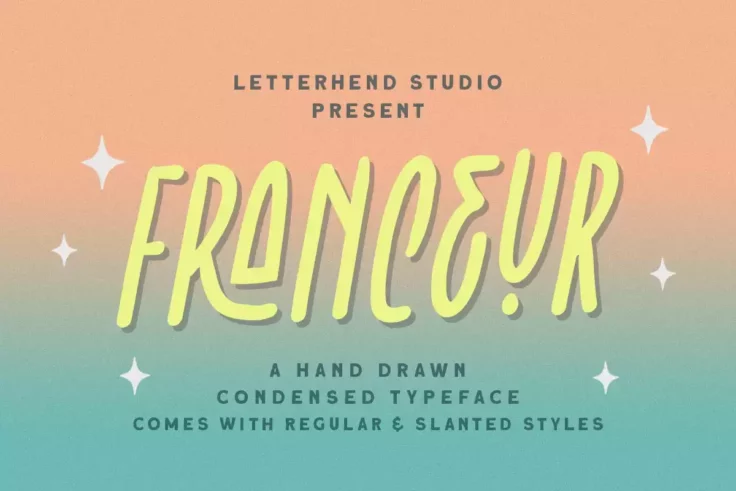
Franceur Cute Condensed Font
If you are looking for a font option with natural handwriting feel, consider Franceur, a stunning typeface design that excels when used for logos, lab...
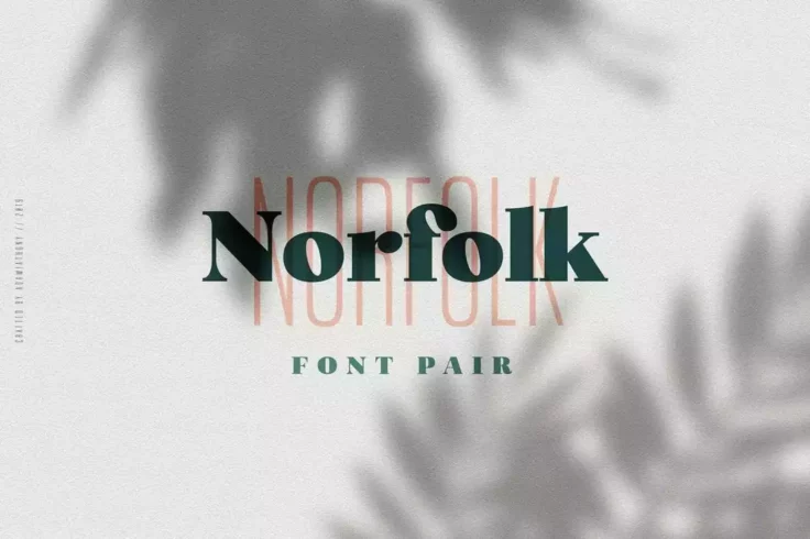
Norfolk Creative Font Pair
This elegant font pair includes both a narrow sans serif font and a bold serif font. Two of which go really well together. You can use both fonts to d...

Story Telling Fun Condensed Font
This fun and quirky condensed font is a great choice for crafting posters, greeting cards, book covers, and more related to children of all ages. The ...

Hipstetic Font Family
Hipstetic is a font family that features a mixed design of hipster and vintage looks. It comes in 4 different font variants and 100 glyphs. Perfect fo...

Latinbrush Typeface Family
This highly creative brush font also features a narrow condensed design. It supports multiple languages and comes in several font variations. It’...
Bosque Line Vintage Narrow Font
The classic vintage design adds a unique and traditional look to this narrow font. It will make your logos and label designs look much more original. ...
FAQs About Condensed & Narrow Fonts
What are Condensed & Narrow Fonts?
Condensed and narrow fonts are typefaces with a slender and elongated design. The characters of these fonts are narrower than regular or standard fonts. Generally, their letterforms are vertically stretched while maintaining proportion and balance in the horizontal direction.
These fonts are ideal for places where space-saving is a critical aspect. They allow more characters to be fit into a given space, thus improving readability, elegance, and style, especially for print and digital applications.
When should you use Condensed & Narrow Fonts?
The primary use for condensed and narrow fonts is when text space is limited. Due to their slim design, they take up less horizontal space than standard fonts. Therefore, they are particularly useful for long headlines or text columns in newspapers, magazines, posters, billboards, or any other graphic design project where space is a concern.
Apart from that, they are also used to create a visually distinctive or unique typography style. However, condensed and narrow fonts should be used thoughtfully, as excessive use can lead to a cluttered or obtrusive design.
What are some popular Condensed & Narrow Fonts?
There are numerous condensed and narrow fonts popular among designers dues to their readability and distinctive style. Some of the most well-known include Helvetica Neue Condensed, Futura Condensed, Bebas Neue, Roboto Condensed, Univers Condensed, Oswald, and Avenir Next Condensed. Each of these fonts has unique characteristics making them suitable for different design needs.
For instance, Helvetica Neue Condensed is renowned for its clean and modern appearance, while Futura Condensed packs a bold punch perfect for display purposes. Nevertheless, each of these fonts is popular due to their ability to convey information succinctly without sacrificing aesthetics.
How can Condensed & Narrow Fonts affect the overall design look?
Condensed and narrow fonts can have a significant impact on the overall look and feel of a design. Due to their unique shape, they can add a sense of modernity, sophistication, or urgency, depending on how they're used. They can help your texts stand out, especially if you're working with a busy background or alongside various other typefaces.
However, like everything else in design, they should be used thoughtfully and sparingly. While they can significantly enhance a design's appearance when used correctly, they can also make your design look cluttered or hard to read if used excessively or inappropriately.
Are Condensed & Narrow Fonts suitable for all types of content?
Condensed and narrow fonts are incredibly versatile and can be used in various designs, including headlines, logos, posters, and brochures. They are particularly effective when you need to deliver a lot of information in a tiny space. They enhance readability by enabling more words to be fit into a given area without looking crowded or overwhelming.
However, while they are suitable for a range of content, they may not be the best choice for body text or longer paragraphs, especially in small print, as their narrowness can reduce readability. When using narrow or condensed fonts, the specific usage, context, and legibility should always be considered to maintain an effective design.