15+ Best Cursive Fonts
Embrace the art of handwriting with our cursive fonts. These flowing scripts are perfect for invitations, stationery, or any design that requires a personal, handwritten touch. Bring elegance and warmth to your projects with these graceful fonts.

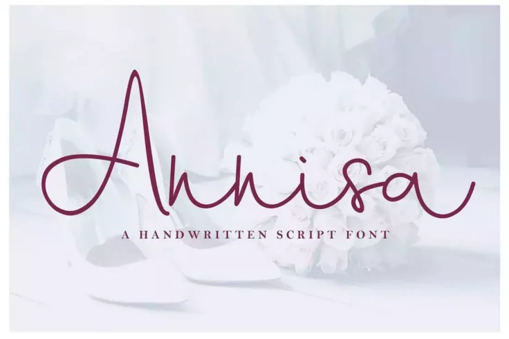
Annisa Handwritten Script Font
This modern handwritten script font has a unique cursive design that makes it much more attractive. The font is most suitable for designing luxury and...
FAQs About Cursive Fonts
What are Cursive Fonts?
Cursive fonts, also known as script fonts, are designed to mimic the fluid, connected strokes that are found in handwriting. They are often used to add an elegant and personal touch to a design.
The term "cursive" comes from the Latin word "cursivus," which means "flowing" or "running." This relates to the flowing movement that a person's hand makes when writing in cursive script. In addition to print and digital media, you might also see cursive fonts used in calligraphy.
When would I use a Cursive Font?
Cursive fonts are commonly used in settings that require a more formal, elegant, or personalized appearance. They are often used for wedding invitations, diplomas, certificates, logos, and headings. Cursive fonts can also be used in short quotes or phrases within a design to draw attention and create emphasis.
However, they are not generally used for large blocks of text, such as in body text or lengthy articles, as the complex and intertwined characters can be harder to read than simpler, non-cursive fonts.
Why are some Cursive Fonts difficult to read?
The readability of cursive fonts can vary widely. Some are designed to mimic handwriting and can be quite intricate, with elaborate loops and swoops, making them more difficult to read. These more complex cursive fonts are often used for aesthetic reasons in design, rather than readability.
Also, people may find cursive fonts hard to read due to a lack of familiarity. There has been a decline in the teaching of cursive handwriting in schools, so the younger generation may find it more challenging to read cursive fonts compared to older generations.
Can I use more than one Cursive Font in a project?
While it is technically possible to use more than one cursive font in a project, doing so can make your design look messy or inconsistent. Generally, it is recommended to stick with just one cursive font per project. This creates a uniform look and make sure your design looks professional.
If you want to create contrast or hierarchy in your text, consider combining a cursive font with a non-cursive font. For instance, you might use a cursive font for your headings and a non-cursive font for your body text.
How do I choose the right Cursive Font?
Choosing the right cursive font would depend on the nature and context of your project. Consider the sentiments you want to evoke. For instance, a font with a lot of fancy swirls and curls might be perfect for a wedding invitation, but probably wouldn't be suitable for a business letter.
You'll also want to consider readability. A good rule of thumb is to save the most intricate and difficult-to-read cursive fonts for shorter texts or design elements. For longer texts, opt for simpler, more legible cursive fonts.