Fonts
Choosing the right font can make-or-break any design project. Explore hundreds of free and premium fonts. Everything from classic, vintage typefaces to bold, modern fonts that pack a contemporary punch. Find the perfect font for your next project.
Explore popular categories:
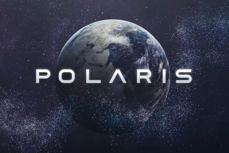
Polaris Space Font
Polaris is a space-themed font designed for futuristic projects. Polaris includes uppercase multilingual letters, numbers, and punctuation marks, maki...
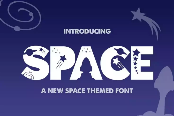
The Space Font
The Space is a captivating silhouette font that transports you to the realm of outer space. Each letter is adorned with playful and imaginative charac...
Learn About Fonts
How Do I Add Fonts to Photoshop?
Learn how to add fonts and start working with them quickly.
What Is a Font License?
Learn the ins and outs of what type of font license you need for your project.
Where Can I Find Free Fonts?
Our pick of the greatest free sources for typefaces online.
How Should I Pair and Combine Fonts?
Tips and tricks for combining stylish fonts in unique and interesting ways.
Broken Console Font
Broken Console is a geometric pixel font that draws inspiration from old-school game consoles that display pixel art in the game view. The font is ava...
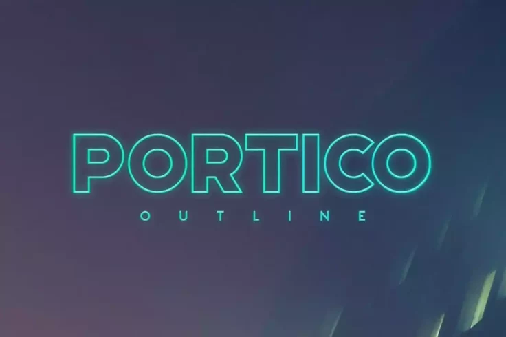
Portico Outline Font
Portico is a popular font choice for outlining in sci-fi, modern, avant-garde, or futuristic design projects. Its bold design makes it ideal for use a...
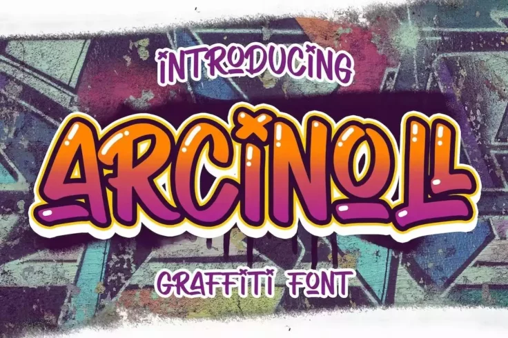
Arcinoll Font
Arcinoll is one of the trendiest graffiti fonts out there! This font can give a unique and playful look to all kinds of graphic designs like posters, ...
Astronova Font
Astronova is a sleek and modern sans-serif font that exudes a minimalist and contemporary aesthetic. With its clean lines and simple shapes, this type...
Morton Font
Morton is a captivating techno sci-fi font that captures the essence of space exploration. The uppercase letters feature a subtle cutout on the corner...
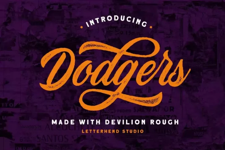
Devilion Rough Baseball Script Font
Devilion is a modern script font that comes with a letter design with the perfect look for crafting classic baseball logos. It features rough-textured...
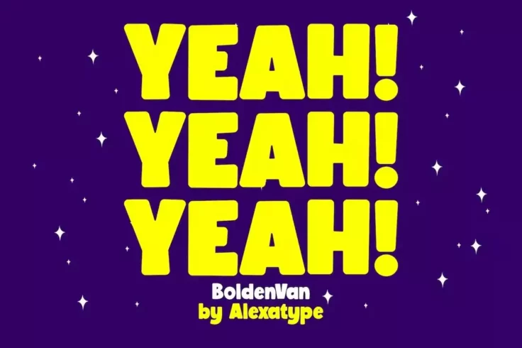
BoldenVan Fun Children’s Fonts
Want to design big titles that grab attention from far away? Then be sure to use this font in your designs. It has big chunky letters that are made ju...
Acrobats Mexican Circus Font
Introducing the “Acrobats Mexican Circus Font”, a playful and energetic typography choice designed to captivate and engross. Perfect for a...
Polygon Technology Font
Polygon is an abstract font that seamlessly blends futuristic elegance with innovation. Its disciplined mesh design, featuring thin lines, creates a d...
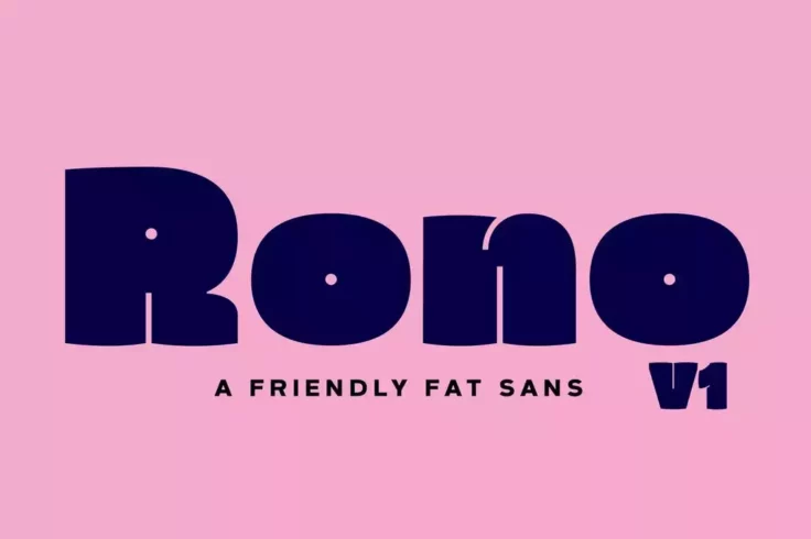
Rono Fat Sans-Serif Font
Rono is an elegant font that comes with chunky character design. This font is perfect for designing stylish titles and headings for posters and websit...
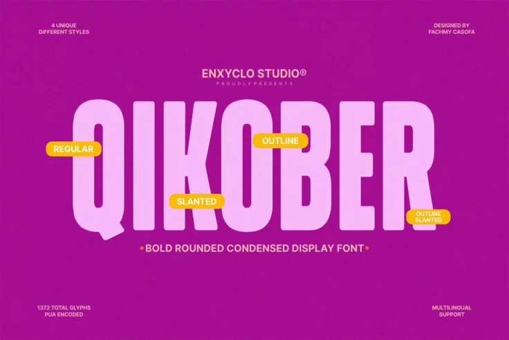
NCL Qikober Bold Rounded Font
The NCL QIKOBER Bold Rounded font is a masterfully designed typography asset that promises to become a firm favorite among creative professionals and ...
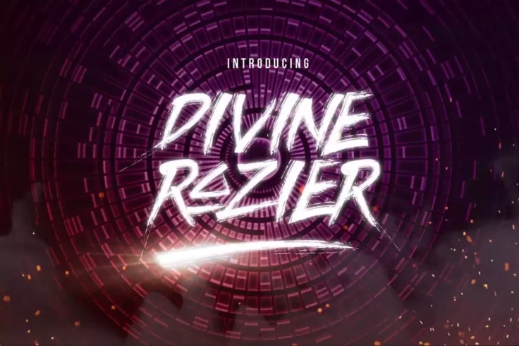
Divine Razier Font
Divine Razier is a brush font with a rough stroke design. It includes a set of letters that features a stylishly futuristic design. You can use with y...
Eternals – Futuristic Space Font
Eternals is a futuristic typeface that captures the essence of space technology and science fiction. This typeface is designed to evoke the feeling of...
Party Tale Happy Birthday Font
Party Tale Happy Birthday Font is a charming display font designed specifically with a unique handwritten style. Ideal for a range of applications, th...
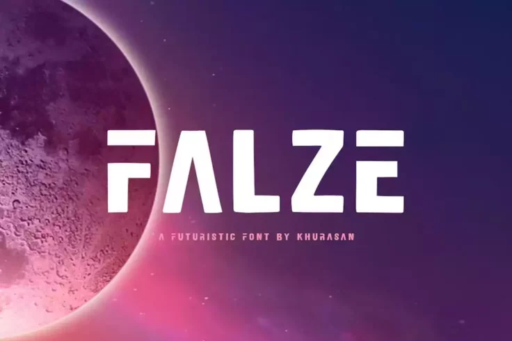
Falze Futuristic Logo Font
Big, bold, and chunky fonts often make logos look so good. This font also has that same look with all the right characteristics for creating modern an...
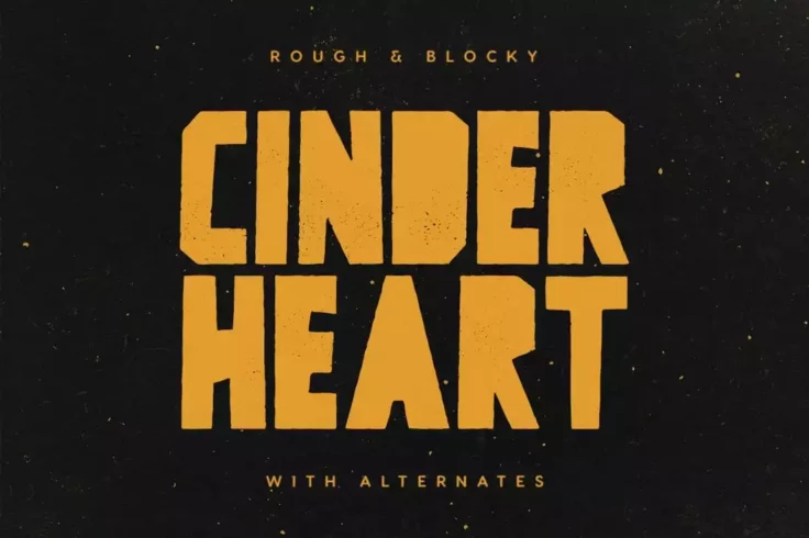
Cinderheart Rough Blocky Font
If you’re looking for a fat blocky font design, this is the perfect font for you. It features a rough textured design and it’s perfect for...
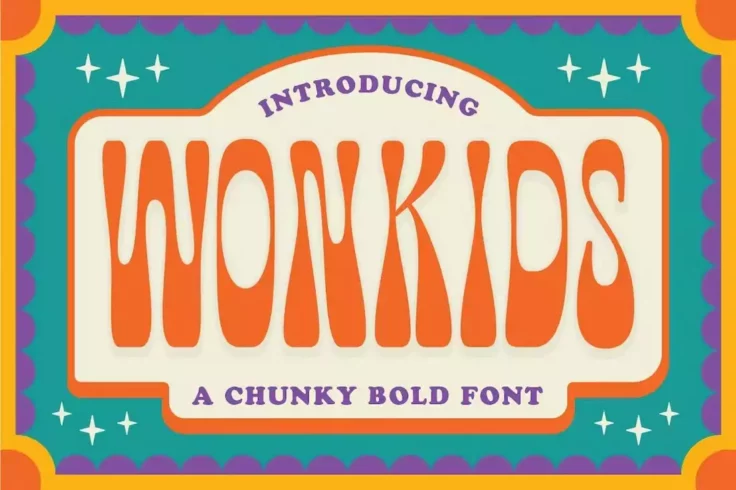
Wonkids Bold Psychedelic Font
Wonkids has a perfectly mellow letter design for designing cool product packaging designs and titles for posters. You can find many creative ways to t...
Hillary Sports Font for Football Teams
Hillary is a bold sports font that features a classic letter design. It’s ideal for making merchandise and logos for various types of sports tea...
Autorich Sans
Autorich is a captivating and contemporary sans-serif font, exuding a distinct space-inspired aesthetic. This font package includes two sets of upperc...
FAQs About Fonts
What are the different types of fonts?
Fonts can be divided into several categories based on their characteristics. The most common categories include Serif fonts, Sans Serif fonts, Script fonts, and Display fonts. Serif fonts have small lines or strokes attached to the ends of larger strokes in a letter or symbol. Examples include Times New Roman and Georgia. Sans Serif fonts, such as Arial and Helvetica, do not have these extra strokes.
Script fonts mimic handwriting and calligraphy. They can range from formal types like Old English style to more casual styles like Brush script. Display fonts are typically used for headers or logos rather than body text, as they can be a bit extravagant for regular reading. They come in a large variety of styles and are often used to convey a specific mood or theme.
What is a web font and how does it differ from a desktop font?
A web font is a font that is used on a website or a web application. Unlike desktop fonts, they are designed to be used on a web platform and to be compatible with different browsers and devices. A web font is hosted on a server and loaded into the user's web browser as needed, thus allowing websites to use typefaces that aren't installed on visitors' computers.
Desktop fonts, on the other hand, are fonts that you install directly onto your computer or workstation. They can be used in any application on your computer like Word, PowerPoint, or Photoshop. Unlike web fonts, they are not designed to be used on a web platform. Each type has its specific uses, and the main difference between them is where and how they are used.
How do I install a font on my computer?
Installing a font on your computer is typically straightforward. First, you download a font file from a trusted source. The downloaded file would usually be in .ttf or .otf format. On a Windows computer, you just right-click on the downloaded font file and select 'Install'. Alternatively, you can go to the 'Fonts' folder in the Control Panel and then drag and drop the font file there.
On a Mac, you open the downloaded font file, which should open in Font Book. From there, you simply select 'Install Font'. For both Windows and Mac, after installing the font, it should be available for use in your applications. Note that some applications may require a restart to register the newly installed font.
Why does a font matter in design?
Fonts play a crucial role in design as they help establish the mood, evoke emotion, and set the tone of the message. The typography you choose can make your design appear serious, comedic, light-hearted, professional, or even whimsical. An inappropriate font can miscommunicate the intended message and put off your audience. Ensuring you choose the right font can create a strong impression and enhance the impact of a design, whether it's a website, poster, or business card.
Moreover, fonts are significant for readability and legibility. Some fonts are more readable than others and make the text easy to scan at a glance. For example, for longer text, it's usually better to use a Serif or Sans Serif font. On the other hand, Script or Display fonts are typically suited for headlines or short pieces of text.
What is kerning and why is it important in font usage?
Kerning refers to the adjustment of space between individual letter pairs in a typeface. Not to be confused with tracking, which adjusts the spacing uniformly over a range of characters, kerning is specific to pairs of letters that may create an awkward or irregular visual space, for example 'AV' or 'WA'. Effective kerning ensures better legibility and aesthetic outcomes in typography. Without proper kerning, a word can look unbalanced, which can affect readability.
This procedure is particularly important in logo design and headlines, where type is at a large size, and kerning issues are more noticeable. While most software offers automatic kerning, often manual adjustments need to be made. Remember, the goal is not to create equal space between letters but to create the illusion of evenly distributed space, making the word visually pleasing and easy to read.