Trends - Page 5

Stay on top of the latest design trends, see what’s popular, and learn how to create design work that feels modern, current, and up-to-date.

Design Trend: Scrolling Text Elements

Trends / 3 May 2022

Design Trend: Scrolling Text Elements

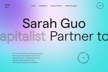
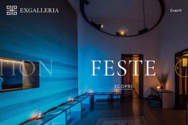
Almost everywhere you go online, there seems to be some sort of animated effect or element. Here’s one more trend in website design and animation: scrolling text elements.

You’ll know this trend the minute you see it because text elements will move on the screen. Sometimes this effect can help aid readability and understanding, whereas other times it is merely a design element. Either way, it’s an eye-catching effect that can help add a unique element to your design.

Let’s dive into this trend, its characteristics, and some examples.
What Are NFTs? a 101 Introduction

Trends / 8 Feb 2022

What Are NFTs? a 101 Introduction

If you haven’t looked into the world of NFTs, now is the time to start getting familiar. Big brands – from the NFL to Macy’s – have jumped into digital ledger trading and collection.

NFT might be one of the biggest buzzwords of 2022, and comes with plenty of implications, and opportunities, for designers.

Here’s a look at everything you need to know to get started with NFTs.

Design Trend: Happy, Optimistic Designs

Trends / 5 Jan 2022

Design Trend: Happy, Optimistic Designs

The last few years have been rough for almost everyone. No matter where you live or what you do, most everyone in the world has felt the stress and pressure resulting from a worldwide health pandemic.

To combat these feelings of misery and malignancy, designers are using happy, optimistic design elements to help create more engaging websites. It’s just the emotional boost we all need when browsing, shopping, or simply looking for information.

Here’s a look at helpful design elements to use with this trend in mind with some examples for inspiration.

10+ Tips for a Trendy and User-Friendly One-Page Website

Trends / 9 Dec 2021

10+ Tips for a Trendy and User-Friendly One-Page Website

Sometimes a one-page website is all you need.

From simple landing pages to coming soon design projects, there are plenty of reasons why you need to have a good grasp of how to create a stellar one-page design. While the idea of one page might not seem intimidating, it can be a tough thing to do.

Here are some tips and tricks to help you design a user-friendly one-page website.

The first example features the full one-page design, but you’ll have to click through for the rest!

Design Trend: Voice UX – Are You Designing for It?

Trends / 27 Sep 2021

Design Trend: Voice UX – Are You Designing for It?

Voice interfaces and user experiences are a trending topic in the world of website design because user behavior is demanding it.

Just think of how often you ask Alexa, Google, or Siri for help on any given day. Think about the push for more accessibly designed websites that work more effectively with devices such as screen readers. Then think about whether these things are coming into play during the design and development process.

They should be.

It is more important than ever to integrate voice UX into your design process.

Design Trend: Frosted Glass Effect in Web Design

Trends / 30 Aug 2021

Design Trend: Frosted Glass Effect in Web Design

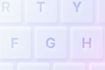
With just the right combination of blur and transparency, you’ve got one of the hottest trends in website and app design – the frosted glass effect.

It is a design technique that uses a gaussian blur, shadows, and transparency to create an element that mimics looking through real-life frosted glass.

Let’s dive into seven different ways to use this design trend.

And, if you need more inspiration, it’s no surprise to know that Dribbble is packed with frosted glass design ideas!

Design Trend: Flat Cards UI

Trends / 17 Aug 2021

Design Trend: Flat Cards UI

Cards are a design element that have been popular for a while. The look and function of them have continued to evolve in a number of ways, from tiny cards that are more of an oversized button to full-screen or split-screen cards that denote click or tap functionality.

The reason this trend remains popular is because of the latter. Cards innately cue users into an element of function.

The most popular iteration of cards right now is in a super flat style that works with almost any type of content. While every example below is different, one thing is the same: the combination of card elements in a flat style.

Let’s look at a selection of websites featuring this design trend and ways that you can make it work for you.

Design Trend: No Images Above the Scroll

Trends / 2 Aug 2021

Design Trend: No Images Above the Scroll

Have you taken notice? More designers are launching websites with no images (or video) above the scroll.

There are a lot of interesting uses of text elements, animated effects, and other divots that keep the result from being boring.

Here’s a look at this website design trend, examples, and how to make it work for you. You’ll be amazed at just how creative you can get, without a single image in sight!

Design Trend: Soft UI

Trends / 23 Jul 2021

Design Trend: Soft UI

There’s a website and app design trend that’s so subtle you almost don’t see it.

Soft UI creates a frost-style or glassy blur where elements sink and extrude from the background to create varying levels of depth and dimension.

Combine this effect with a softer, more pastel color palette, and the result is a light, “soft” interface with depth in shadows and subtle overall effects.

Here, we’ll look at the trend with examples.

Full-Screen Video Backgrounds in Web Design: Pros, Cons & Tips

Trends / 22 Jul 2021

Full-Screen Video Backgrounds in Web Design: Pros, Cons & Tips

There’s still a debate going on in the web design community on whether video backgrounds in websites are good or bad.

However, we’ve seen a rise in websites utilizing fullscreen video backgrounds in the past few months than ever before. But is it really an effective strategy? Does it help engage with an audience? Does it affect SEO? Let’s find out.

In this guide, we aim to find answers to these questions by comparing the pros and cons of using fullscreen video backgrounds in web design. We’ll also give you a few tips on properly implementing a great video background with examples. Let’s dive in.

7 Tips for a More Gender-Neutral Design

Trends / 15 Jul 2021

7 Tips for a More Gender-Neutral Design

Are your designs as inclusive as they could be? Do they appeal to all people of all genders equally?

While design theory can put a lot of emphasis on creating personas for better user experience and design journeys, they can sometimes not be as inclusive as you might like. Do you get so involved in the persona that you forget every other type of user that might visit your website?

The first step toward a more gender-neutral web, is recognizing common practices and changing the way we think about some of the things we design with every day.

The key to making it actually work is authenticity. You have to believe in gender-neutral messaging for it to actually resonate with website visitors.

Design Trend: Gaussian Blur

Trends / 8 Jul 2021

Design Trend: Gaussian Blur

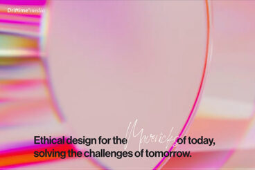
It’s the website design trend that you see everywhere but might not have a name for: gaussian blur.

It’s present in several other named trends that have been popular this year and for some time, including the frosted glass effect, creating image depth, bokeh backgrounds, and even for various other background techniques.

Here, we’ll look at this design trend, explore different reasons for deploying it (carefully!), along with examples to help you make the most of it.

Let’s dive in!