Trends - Page 8

Stay on top of the latest design trends, see what’s popular, and learn how to create design work that feels modern, current, and up-to-date.

How to Use the 2020 Pantone Color of the Year in Design Projects

Trends / 1 Jan 2020

How to Use the 2020 Pantone Color of the Year in Design Projects

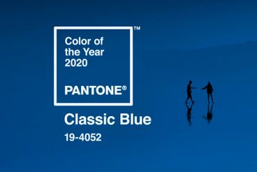
It might be one of the best public relations moves in the design world. Pantone releases an annual color of the year that sets the tone for color trends for a 12-month cycle.

This year’s selection – Classic Blue – is a color that’s highly usable, stable, and instills confidence. A color close to this is likely part of a brand palette that you are familiar with.

Here’s a look at Classic Blue and how the color – and similar colors – as inspiration for using the color (or not) in design projects this year.
Vintage Graphic Design: Inspiration, Ideas + Modern Takes

Trends / 27 Nov 2019

Vintage Graphic Design: Inspiration, Ideas + Modern Takes

Vintage graphic design is a nifty way to create an old-school feel for projects. Today we’re exploring the vintage graphic design trend, and how to use it in your design projects.

Vintage elements can include typography, illustrations, photo styles, and even entire aesthetic palettes. Further, there are different eras to choose from when you want to go for a vintage feel.

Vintage themes from different time periods can provide completely different visual properties and techniques to play with.

Let’s explore some of them!

What Is Modern UI Design? 10 Tips & Examples

Trends / 30 Oct 2019

What Is Modern UI Design? 10 Tips & Examples

Chances are that you might not be able to list the aesthetics of a modern user interface, but you sure know when you land on a website that doesn’t use one. It just feels dated.

Modern UI design helps establish credibility for your website or brand because it has a style that fits what most people to be a current visual aesthetic. This might include visual trends, adapting to usability standards and patterns, and using development techniques that are appropriate for today’s users.

Here, we’re going to look at elements that you’ll find in modern user interfaces. Hopefully, most of these examples seem pretty familiar, but if not, it might be time to plan a little web refresh.

The Art of Website UI Button Design: 10 Trends & Tips

Trends / 28 Oct 2019

The Art of Website UI Button Design: 10 Trends & Tips

Great button design is something that most website users never think about… because when it works well, it’s almost invisible. The best buttons are easy to click or tap, have an obvious function, and help users interact with the design without thinking.

It’s a fairly simple formula, but it can be hard to design if you leave it as an afterthought.

Today, we’re looking at trends in button design, plus a few tips to help you design a UI button that people click over and over again. Give your button design a boost with these tips, trends, and ideas to spark inspiration.

10 Website Design Trends That Are Fading (Thankfully)

Trends / 2 Oct 2019

10 Website Design Trends That Are Fading (Thankfully)

Website design trends can be a lot of fun to experiment with and incorporate into projects, but if you aren’t careful these elements can add a dated look to projects. Sometimes trends fade out as quickly as they rush in!

Here, we’re going to look at some website design trends that are fading. (And that’s a good thing.)

If you have these elements on your site, it might be time to consider a refresh.

8 Packaging and Label Design Trends

Trends / 17 Jul 2019

8 Packaging and Label Design Trends

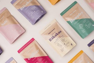
Have you taken notice of that beer car or shampoo bottle lately? How about the wrapper on a snack bar or package that comes in the mail? Packaging and label design trends can be some of the most practical influencers in graphic design.

While we put a lot of focus on website design and digital trends, packaging and labels can impact everything. From whether you make a purchase off the shelf, to how you feel about a product when you open or use it.

Design is a major influencer in purchasing decisions.

Here, we are looking at eight key packaging and label design trends of 2019, and how they aren’t just for physical elements. Many of these same design trends are making an impact in the digital space as well. And while we know packaging trends tend to have more shelf life, literally, how do digital and physical design trends impact one another?

Isometric Design & Illustration: An Eye-Catching Trend

Trends / 5 Jun 2019

Isometric Design & Illustration: An Eye-Catching Trend

Icons form an integral part of any website design. From use in informational and navigational elements, to eye-catching parts of a larger design, icons and icon-based elements can be an attractive and interesting way to draw in users.

While icons have used a dramatically flat aesthetic for a while, more projects are shifting to isometric icon usage. This trend is appearing on websites and print projects across plenty of different industries.

It’s gaining popularity because isometric icons have a more realistic look while still using flat layers. It’s an almost perfect mix of flat and depth. Here’s a more in-depth look at this design trend and how you can make the most of it.

5 Design Ideas That Never Get Old

Trends / 20 May 2019

5 Design Ideas That Never Get Old

There are some design ideas and concepts that never get old, no matter how many times you see them. Today, we’re exploring these timeless design ideas that you can incorporate into your own work.

These classic concepts are often deeply rooted in design theory. They might be trending styles that cycle in and out over time. They all incorporate elements that make a website design easy to look at, interact with, read and understand.

And for that reason, these design ideas never seem to get old. In fact, you can call them timeless design styles.

Design Trends: When to Use Them + When to Ignore Them

Trends / 13 May 2019

Design Trends: When to Use Them + When to Ignore Them

We showcase a lot of design trends here at Design Shack. Not only is it fun to look at examples of new work, groundbreaking projects, and things that are growing in popularity, but it can also serve as a bit of design inspiration.

You can use trends to determine if your projects look modern, classic or just plain dated. But design trends aren’t for everyone all the time. That trend that looks amazing for one brand or project might be a disaster for another.

So how do you know when to use design trends (and when to just ignore them altogether)? Here’s your primer!

Mid-Century Modern Design: An Emerging Trend

Trends / 10 Apr 2019

Mid-Century Modern Design: An Emerging Trend

Of all the retro design styles that have been trending, mid-century modern design might be one of my favorites. The phrase “mid-century modern” is more than just a staple on home improvement television shows, it’s also a classic art and design style that speaks to an era.

The best thing about mid-century modern design is that it can simplify the complex. It was a popular style in homes and décor, as well as graphic and product design in for decades spanning the 1930s, 40s, 50s, and 60s.

Now it is making a comeback as a graphic and web design trend.

Design Trend: Using Watercolor Patterns in Web Design

Graphics / 1 Oct 2018

Design Trend: Using Watercolor Patterns in Web Design

Add a little art to your web design with the watercolor trend. Watercolor techniques are a popular design option because they are fun, easy to use and work with a variety of different types of content.

Watercolor styles can be used in a number of ways to emphasize your content. Whether you are considering a watercolor look for your website framework or just want to experiment with the style, we have a collection of ideas, examples, and resources to help you get started.

Design Trend: Bubble & Blob Backgrounds

Background Textures / 12 Sep 2018

Design Trend: Bubble & Blob Backgrounds

Have you noticed all the fluid, boundless shapes in design projects recently? The use of bubbles and blobs is trending. From simple circles to interconnecting loops, to full-screen blobs that move and shift, to simple “blobby” animations, this trend is popping up everywhere.

The nice thing is that while using bubbles and blobs is a trendy design element, there are so many different ways to do it, and you won’t end up with a design that looks like you are just trying to add a fashionable element.

Here, we have a collection of mini case studies of website designs featuring the bubble and blob design trend.